This project was one of the biggest challenges I ever had in my years as a designer. The client’s brief changed several times over the course of this project and I had to design iteration after iteration of new concepts before finally to the client’s satisfaction.
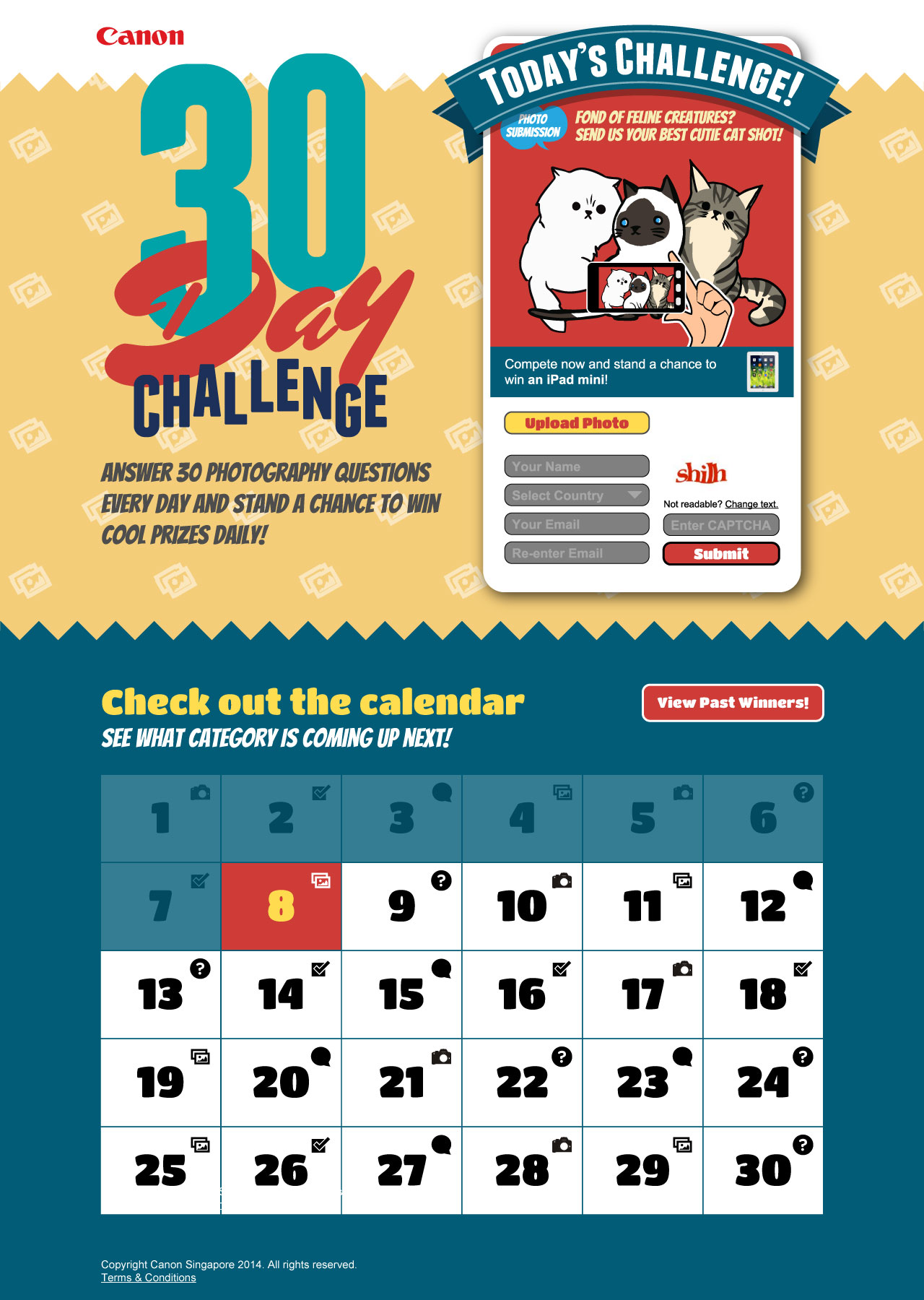
In the first proposal, the brief was to announce the 30-day challenge coupled with a calendar format to indicate the progress of the challenge.
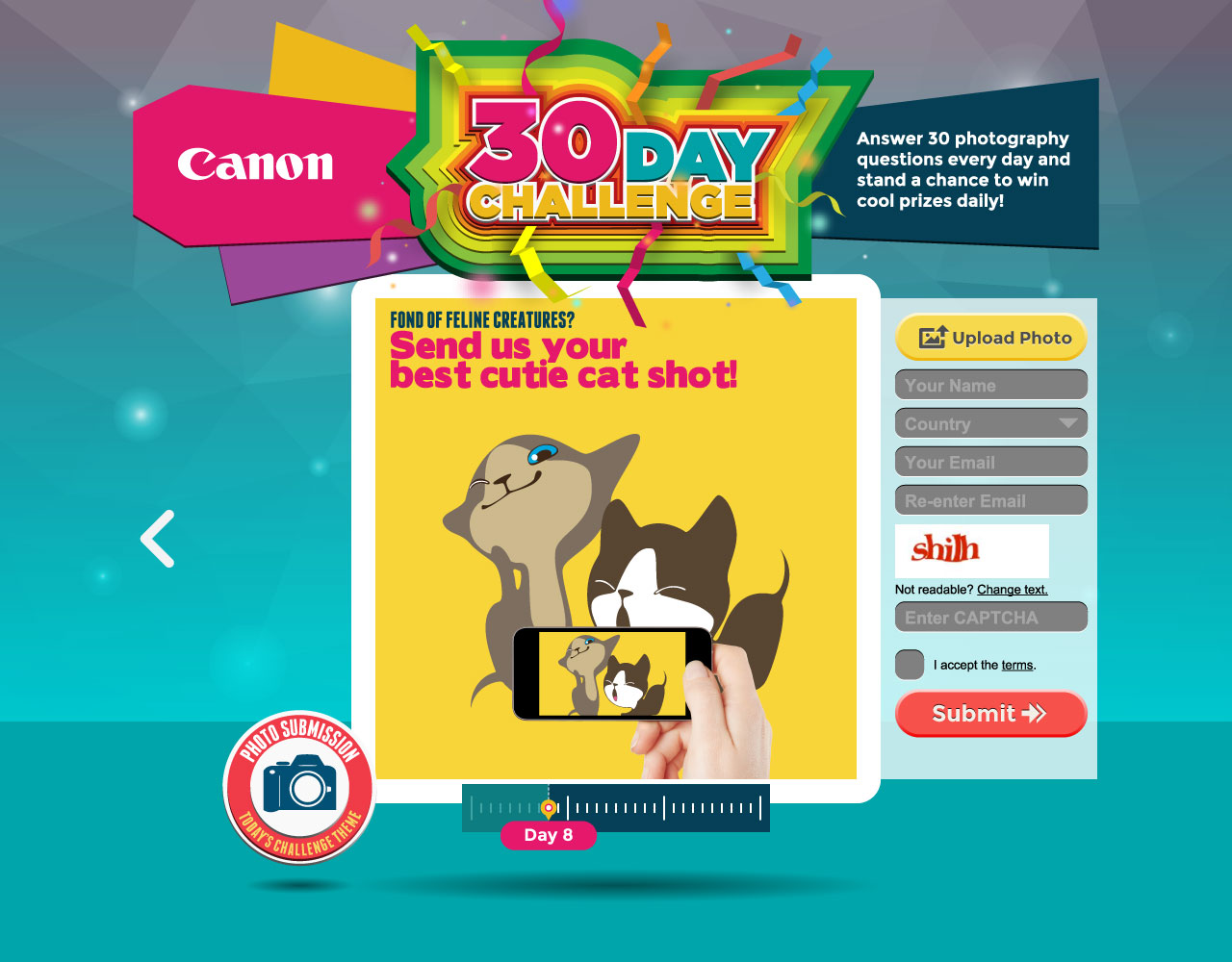
The client initially seemed okay with the art direction (flat style) and suggested fresher colours, so I updated the concept with a more dynamic layout and brighter colours, retaining the calendar format.

However the client decided at this point that they did not like the art direction, so I came up with a new concept, inspired loosely by game shows.
It wasn’t acceptable still, so I did another fresh new concept, basing the visual layout of a stopwatch to indicate the 30 day challenge.
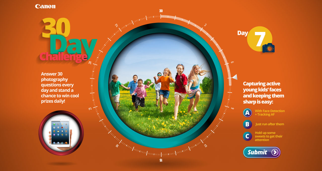
Proposal #3
The client at this point expressed an interest in shiny user interface, but wanted a new layout, so I came up with this.
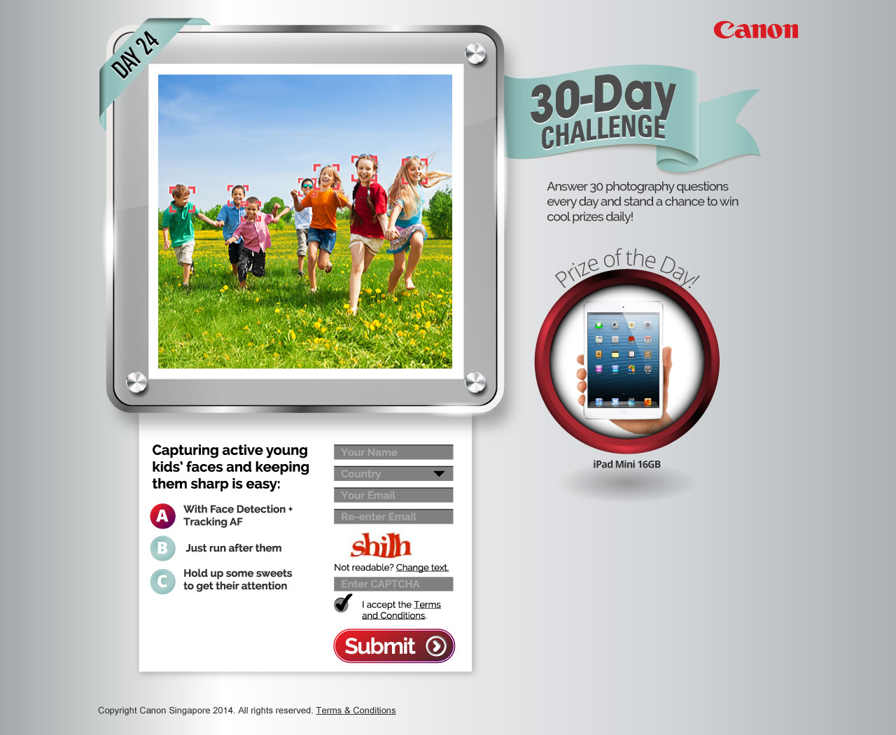
Proposal #4
Client expressed dislike of the layout, so I tried something else.
Proposal #5
And another.

Proposal #6
And another.
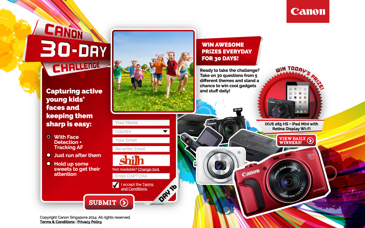
Proposal #7
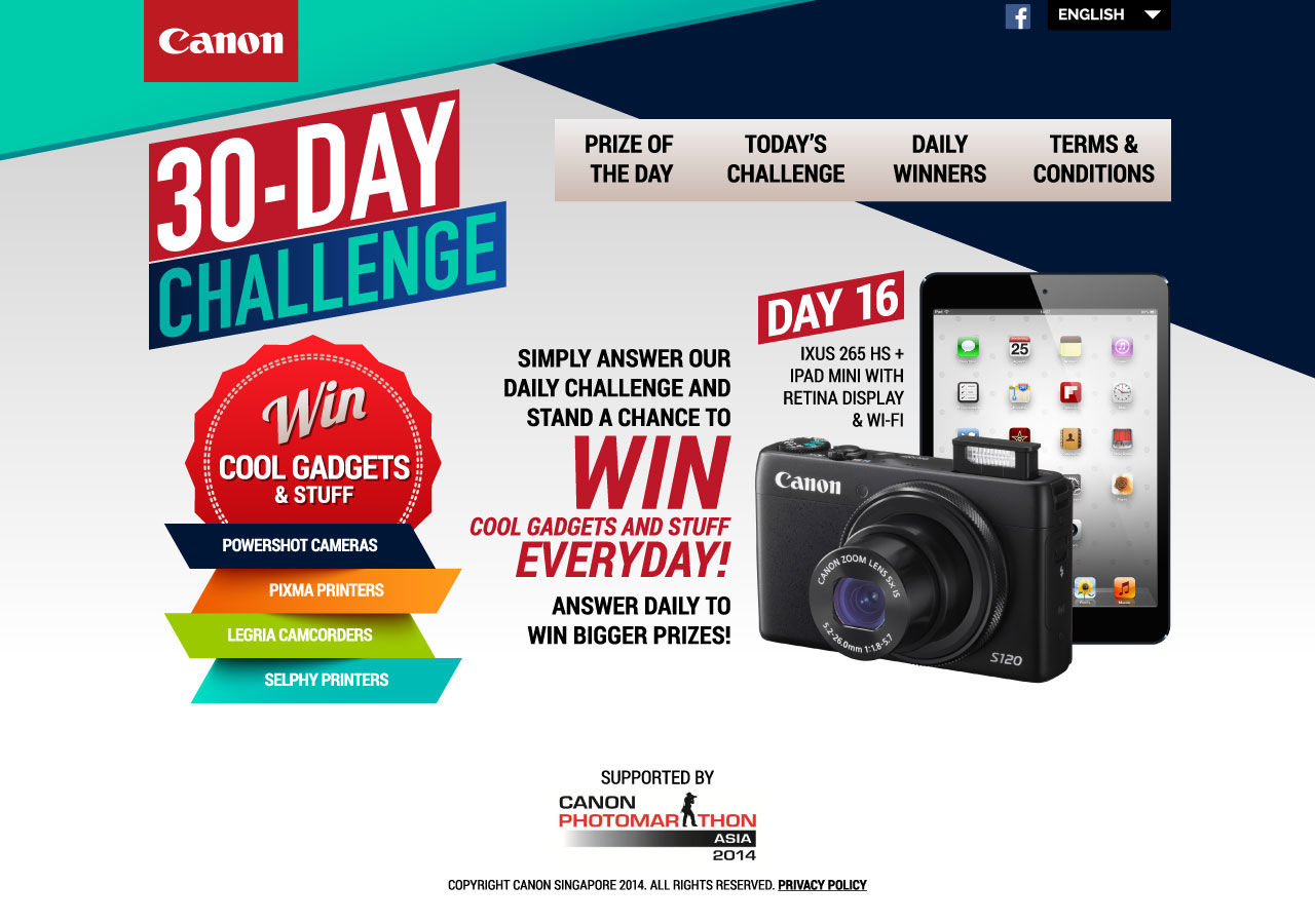
And another… which I finally hit the jackpot with.

Proposal #8


