For the Professional Practice module in my Bachelor of Arts degree, I chose the entity “Singularity” to represent myself as a designer as I am effectively a single individual running my own design business . This corresponds to the definition of singularity as the state, fact, quality, or condition of being singular.
Logo Design
In physics and mathematics, it refers to a point at which a function takes an infinite value, especially in space–time when matter is infinitely dense, such as at the centre of a black hole . This statement concurs with the ideal that design, as a discipline, has infinite and vast outcomes and possibilities.
A singularity is also defined as a hypothetical moment in time when artificial intelligence and other technologies have become so advanced that humanity undergoes a dramatic and irreversible change . In my professional career so far mainly producing digital work involving user experience and interface design, there is no more apt statement to describe how the internet and technology has influenced humanity permanently and my privilege to be a proponent of such a change as a web designer.

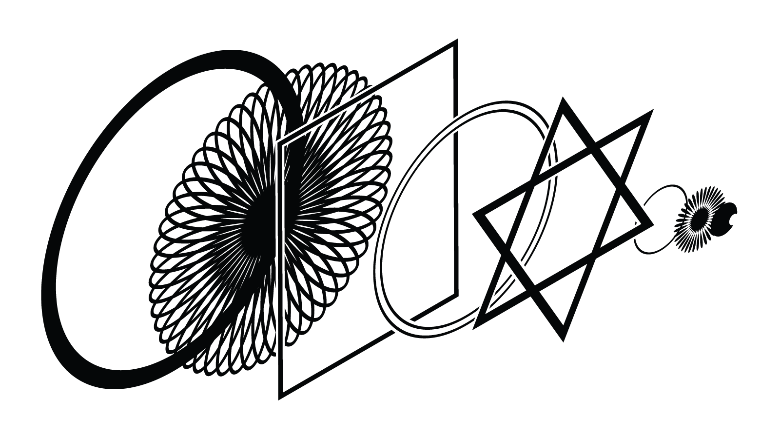
The logo which would eventually represent my entity has to be bold and distinct to provoke attention. I have always loved geometry, which in itself is a close relative of design, as design can be said to be made out of shapes, grids, lines and dots. With that in mind, I sought to incorporate such elements into my logo. I experimented with the composition of combining basic shapes in geometry to construct my logo. Hence the promulgation of circles, rectangles and triangles. An important aspect of my logo is symmetry, which I felt would further underline the impression of infinity, as a neverending cycle. Finally, I wanted to have an eye symbol to perpetuate the idea of being singular.
Corporate Identity

Résumé


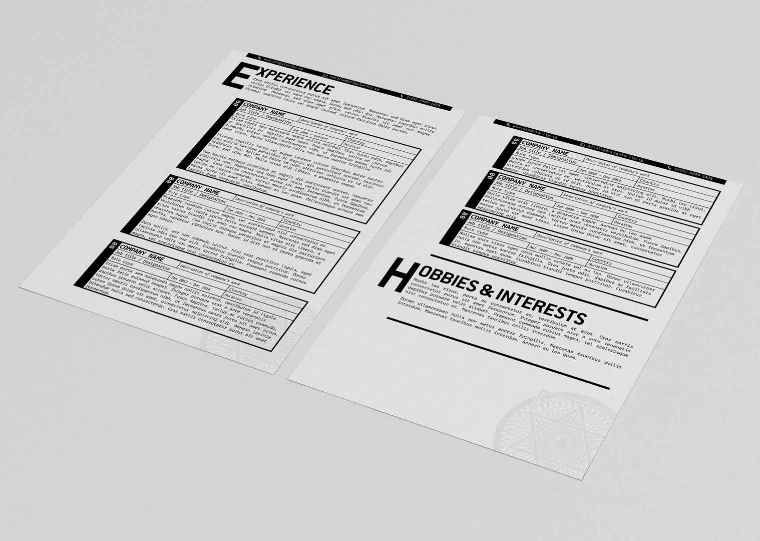
Website
I sought to showcase my portfolio in a website as equally minmal and sleek, with a clean distinguished layout, large typography and smooth, linear user experience for the work itself to take centrestage. Taking advantage of the interactive capabilities of the digital medium, my logo will not be a static image but a constantly animating entity. On loading the first fold, the user is greeted by my animated logo centred on the page. When user scrolls past, the logo shrinks to the corner, continually animating.
The website is a one-page scroll, keeping the user flow and interactivity succinct and linear. The second fold gives the user the definition of the word Singularity (which appears letter by letter), hopefully offering some insight on the concept of my entity.
Upon clicking any one of the work items, an overlay is loaded with the work’s details, which user can scroll down to view more or click the large X button to close. There is no loading of a new page, to keep the user experience as smooth as possible. The minimized logo, during all this, keeps animating uninterrupted in the corner.
Upon clicking any one of the work items, an overlay is loaded with the work’s details, which user can scroll down to view more or click the large X button to close. There is no loading of a new page, to keep the user experience as smooth as possible. The minimized logo, during all this, keeps animating uninterrupted in the corner. User is able to click X to return to the main grid of works for a seamless user experience.
The website was designed and coded entirely from scratch by myself, using WordPress as a Content Management System.
Promotional Materials
Due to the striking nature of the logo, it is suitable for a variety of promotional materials on its own. By having the logo present on items that are useful, people are likely to keep and utilize them, allowing my brand to keep making visual impressions.

A mug is a good example of this, and can be produced cheaply enough. Potential clients who receive this will likely keep it because it would be a waste to simply throw it away since it does serve a function. When it does end up being used, the mug likely sits on their desk next to their workspace, visually reminding them of my brand every time they take a break from their work to have a sip of their coffee or tea as they re-energize. It is the aim to have my brand, in time, would be associated with positive feelings of relaxation, nourishment and re-energization.
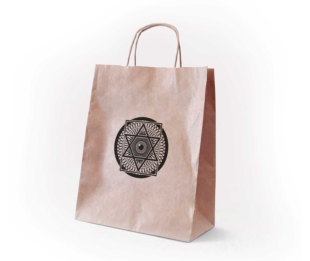
A paperbag, although definitely more disposable than the mug, is also a good promotional item that is can also be cheaply produced. Apart from its usefulness in packaging items conveniently, bringing around the paperbag would gain more viewership when it is taken out. As mentioned, the striking logo would make many impressions and hopefully would be the topic of conversations. This would then ingrain in the paperbag holder’s mind that my brand is noticeable and attractive.
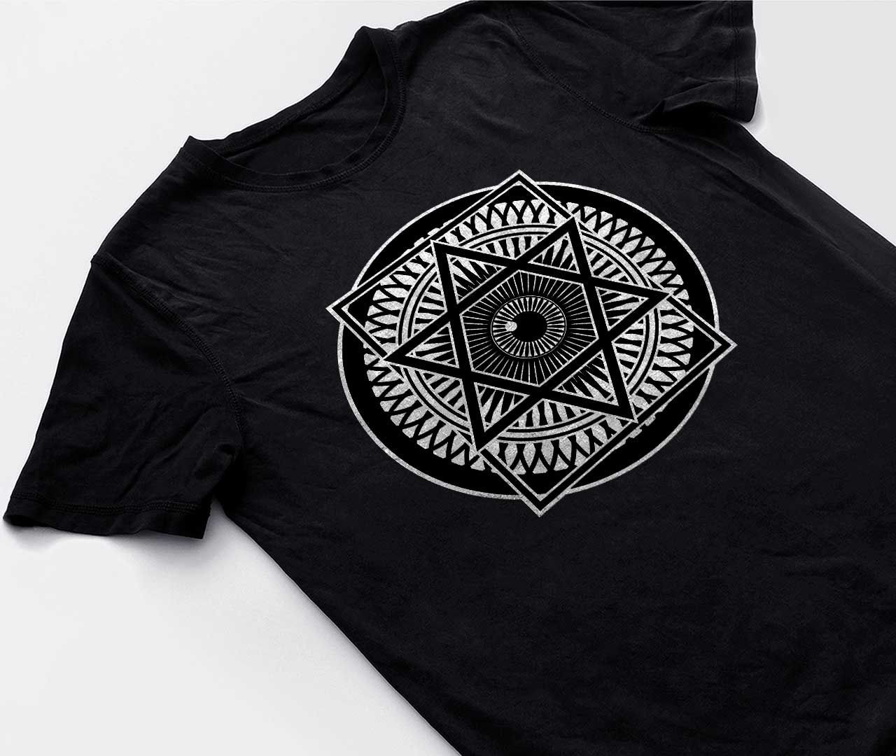
Similarly, t-shirts can also be produced with the logo. The design is contemporary and chic enough to be able to carry itself as a singular graphic on apparel.