Eye Witness is a typographic publication project from the 2016 student assessment brief by the International Society of Typographic Designers, completed during my undergraduate programme. ISTD engages with universities and institutions across the globe to raise the profile of typography in design education. The goal is to explore and develop typography as an inherent part of the design process and thus bring the typographic gesture to the forefront of their design education.
The Brief: “Eye Witness”
Translate a written, first person account of a significant event, into a typographic experience that is designed as a site-specific installation in the gallery of your choice. The original writing should have appeared in traditional print media; a newspaper or a book, which has been commissioned and edited. This site-specific piece can be printed, projected, installed, or anything else you can think of – depending upon how you want to use the space you have chosen. But remember, depending on your solution, all the usual rules of typography for the page may well be redundant; The grid becomes a three dimensional space and the line may be the length of a wall, not twelve to fourteen words in a single column on a page. You may be reading the ceiling and the floor as well as text that follows the usual path of your eye-line. However, you should still consider hierarchy, readability and the emotional engagement of the viewer.
The Significant Event
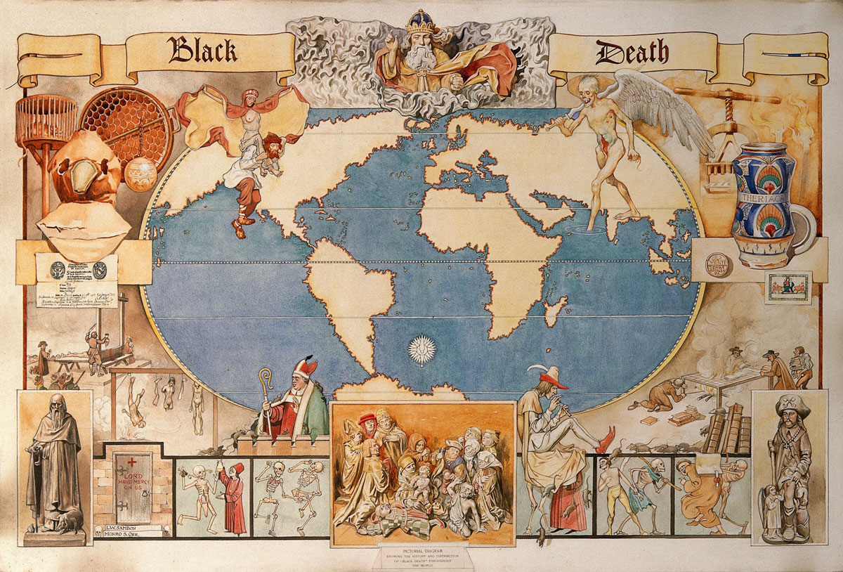
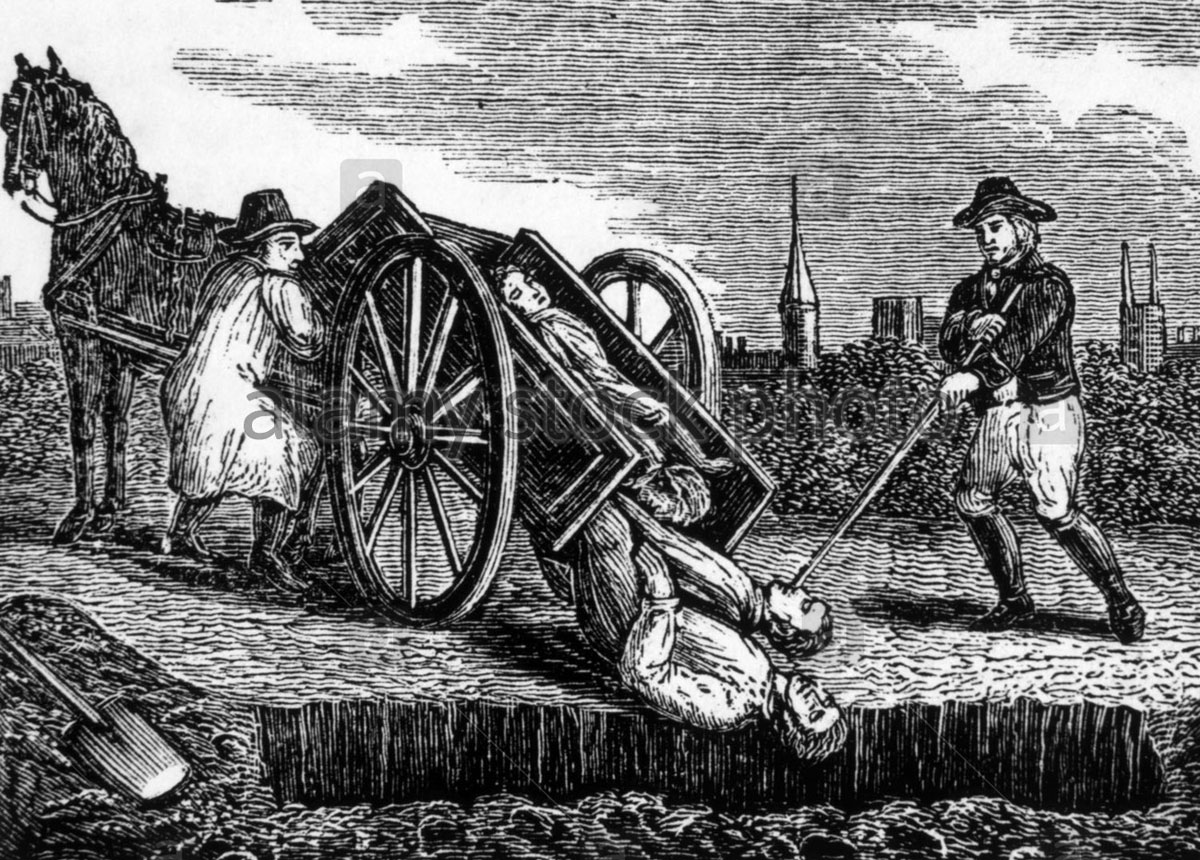
The Black Death was one of the most devastating pandemics in human history, resulting in the deaths of an estimated 75 to 200 million people and peaking in Europe in the years 1346–1353. Spreading throughout the Mediterranean and Europe, the Black Death is estimated to have killed 30–60% of europe’s total population. The plague created a series of religious, social, and economic upheavals, which had profound effects on the course of european history.
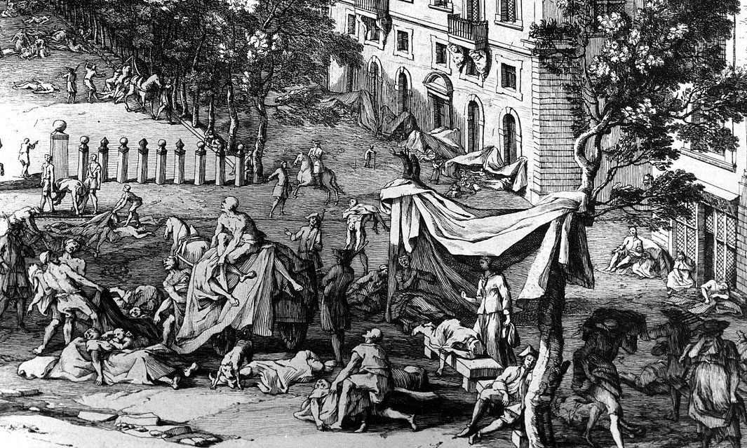
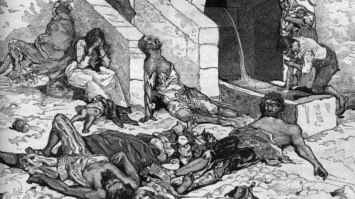
Having no defence and no understanding of the cause of the pestilence, the men, women and children caught in its onslaught were bewildered, panicked, and finally devastated.
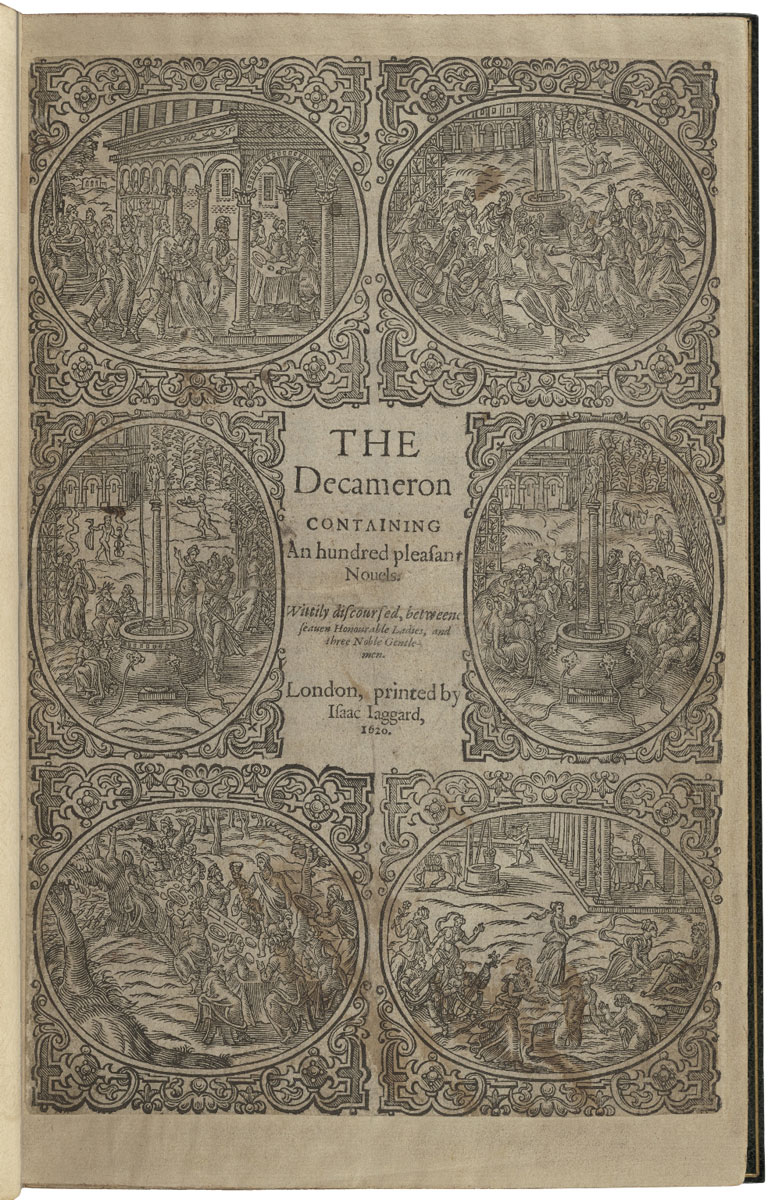
Giovanni Boccaccio – The Decameron (1886)
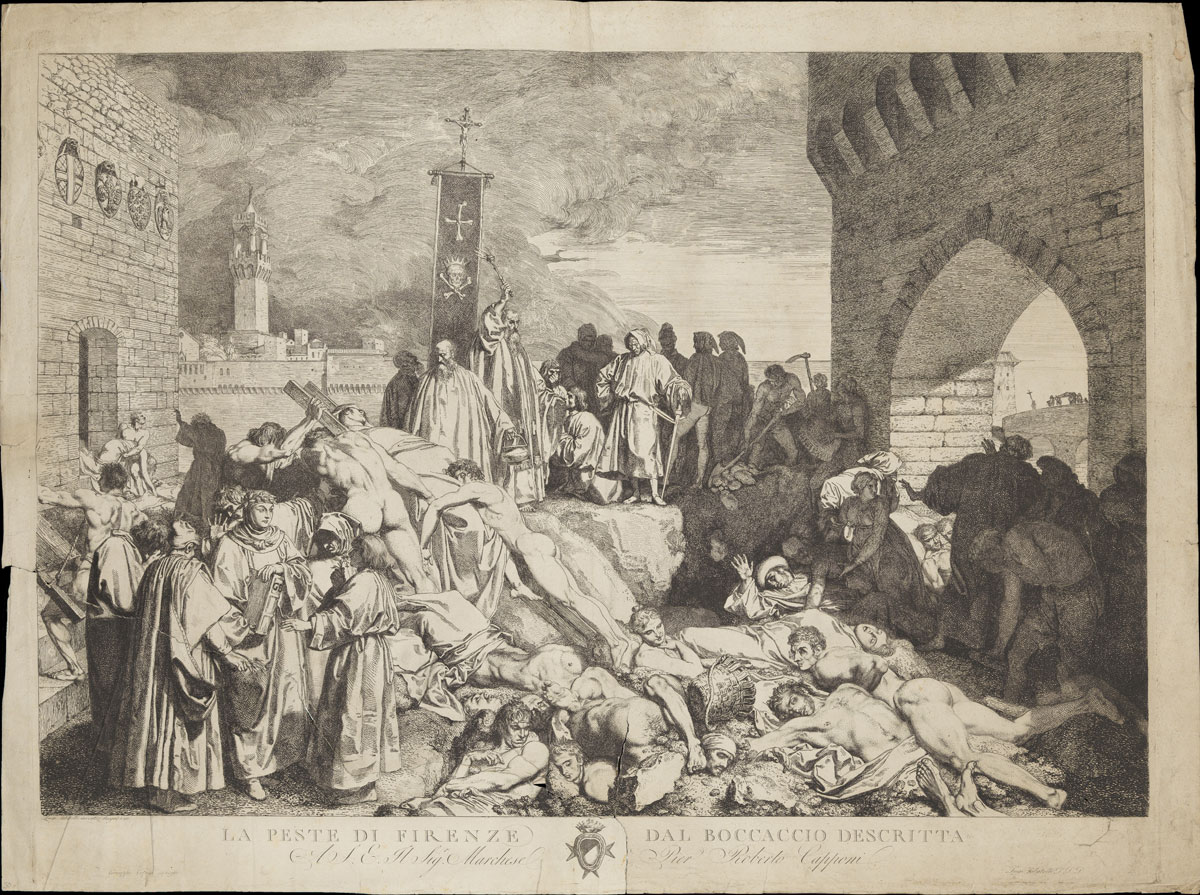
The Decameron (Italian: Decameron or Decamerone), subtitled Prince Galehaut (old Italian: Prencipe Galeotto), is a collection of novellas by the 14th-century Italian author Giovanni Boccaccio (1313–1375) who lived through the plague as it ravaged the city of Florence in 1348. The book is structured as a frame story containing 100 tales told by a group of seven young women and three young men sheltering in a secluded villa just outside Florence to escape the Black Death, which was afflicting the city.
In his introduction to the fictional portion of his book, Boccaccio gives a graphic description of the effects of the epidemic on his city. The various tales of love in The Decameron range from the erotic to the tragic. Tales of wit, practical jokes, and life lessons contribute to the mosaic.
In addition to its literary value and widespread influence (for example on Chaucer’s The Canterbury Tales), it provides a document of life at the time. Written in the vernacular of the Florentine language, it is considered a masterpiece of classical early Italian prose.
Image Research


Design Strategy
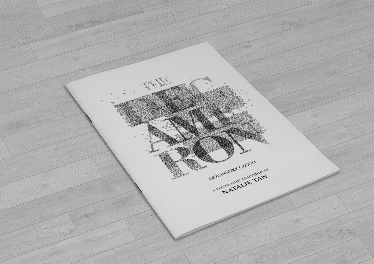
I will be creating a book based on the Decameron’s introductory text where Boccaccio gives a graphic description of the effects of the epidemic on his city.
My purpose is to engage the reader via the juxtaposition of typography (akin to Tomato’s “Mmm.. Skyscraper I Love You” and Paul van Ostaijen’s “Bezette Stad”) to deliver an intimate insight into the circumstances of the Black Death from Boccaccio’s text, using typography’s shapes to express the despair, horror and hopelessness of the account.
My interest in this event was piqued by imagining the sheer terror of the people living through the plague, especially during that time when science and medicine had not yet been re ned enough to easily diagnose and treat this malady.
Process
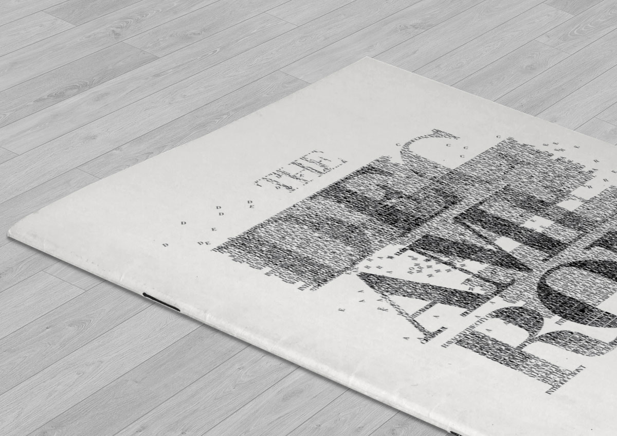
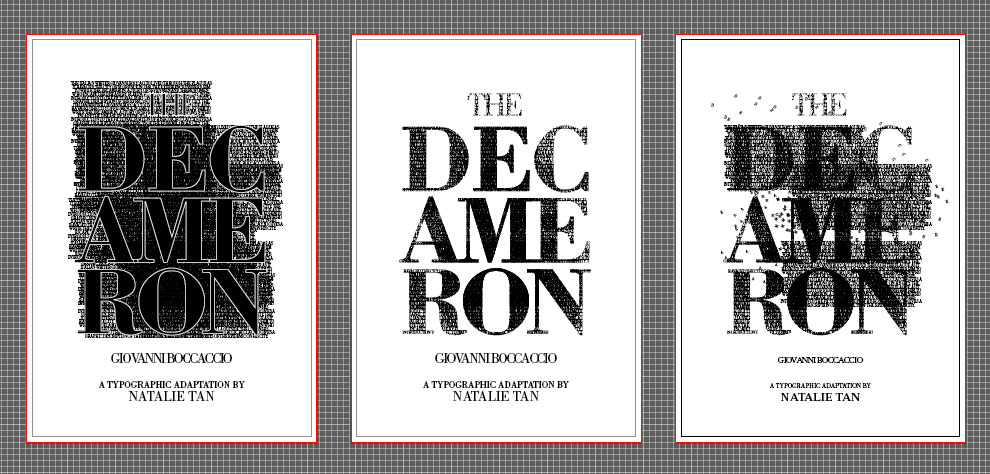
Since I am afterall describing the plague, I decided to try and make the publication look ‘diseased’.
Starting with the cover page, I diffused some of the lettering to add on the feeling of contagiousness and make the whole typography look a little more “itchy”.
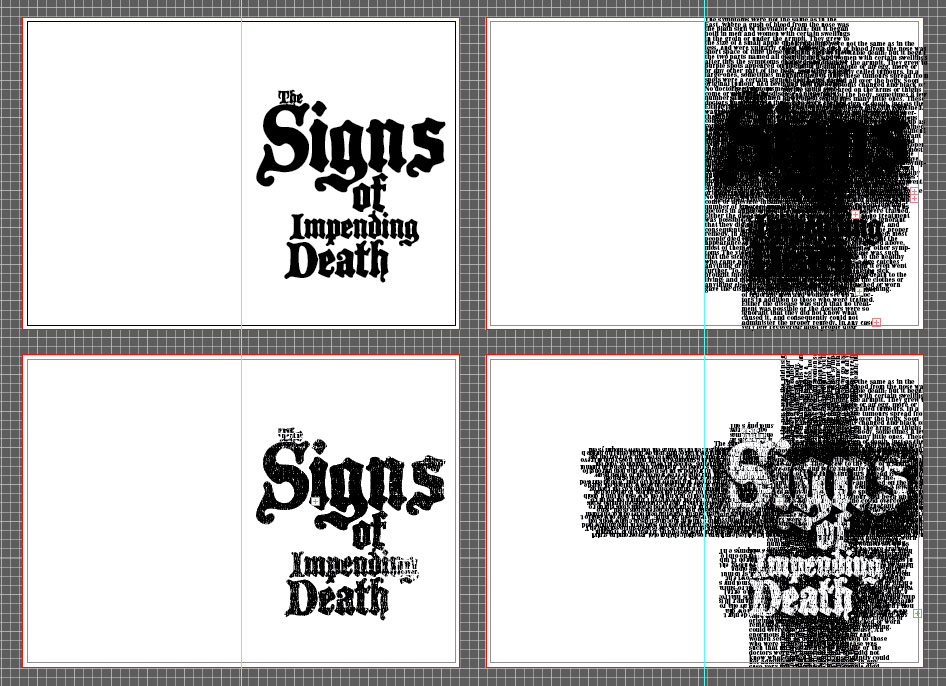
I wanted to give each chapter it’s own full page title typography. Drawing further from my final selection of the cover page typography, I wanted to continue expressing a swarming, overwhelming perception. What would a victim feel like when they start seeing the first signs of the plague? I hid a subtle cross within the filler text (which was actually the complete text of this chapter) using overlapping effect.
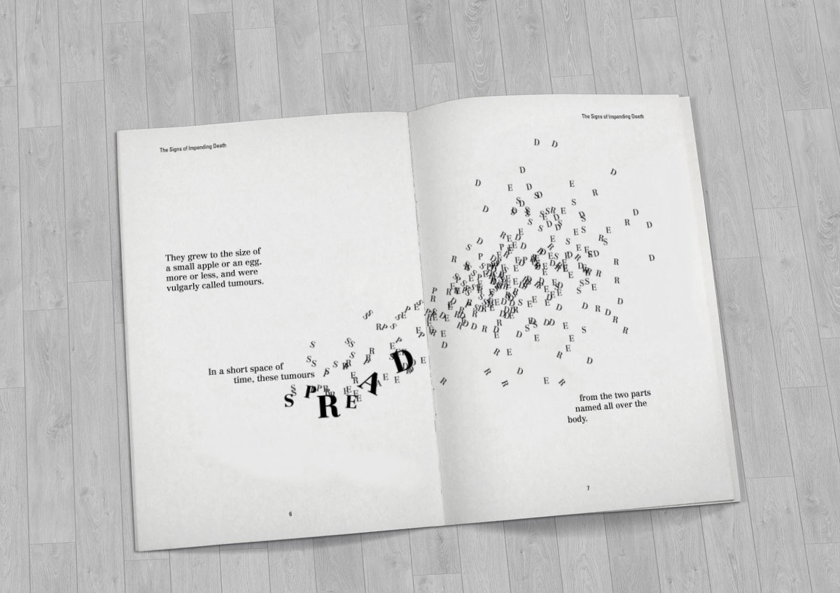
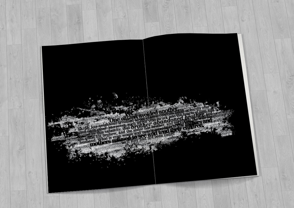
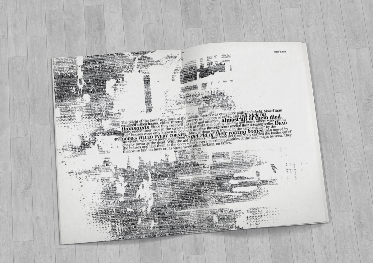
When tackling the contents itself, I began exploring playing with text using methods such as scattering letterforms to form shapes that further bring depth to the interpretation.
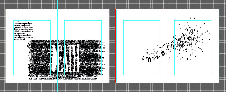
My exploration took me to exploring the idea of using shapes to wrap my text in to convey the emotions expressed in context. The text in general is meant to be experienced instead of read. To evoke certain mental associations with the message of the text, the relevant keywords would sometimes be highlighted in bolder or larger font size. The masking shapes are meant to provide an atmosphere to the text.
Final Outcome: The Publication