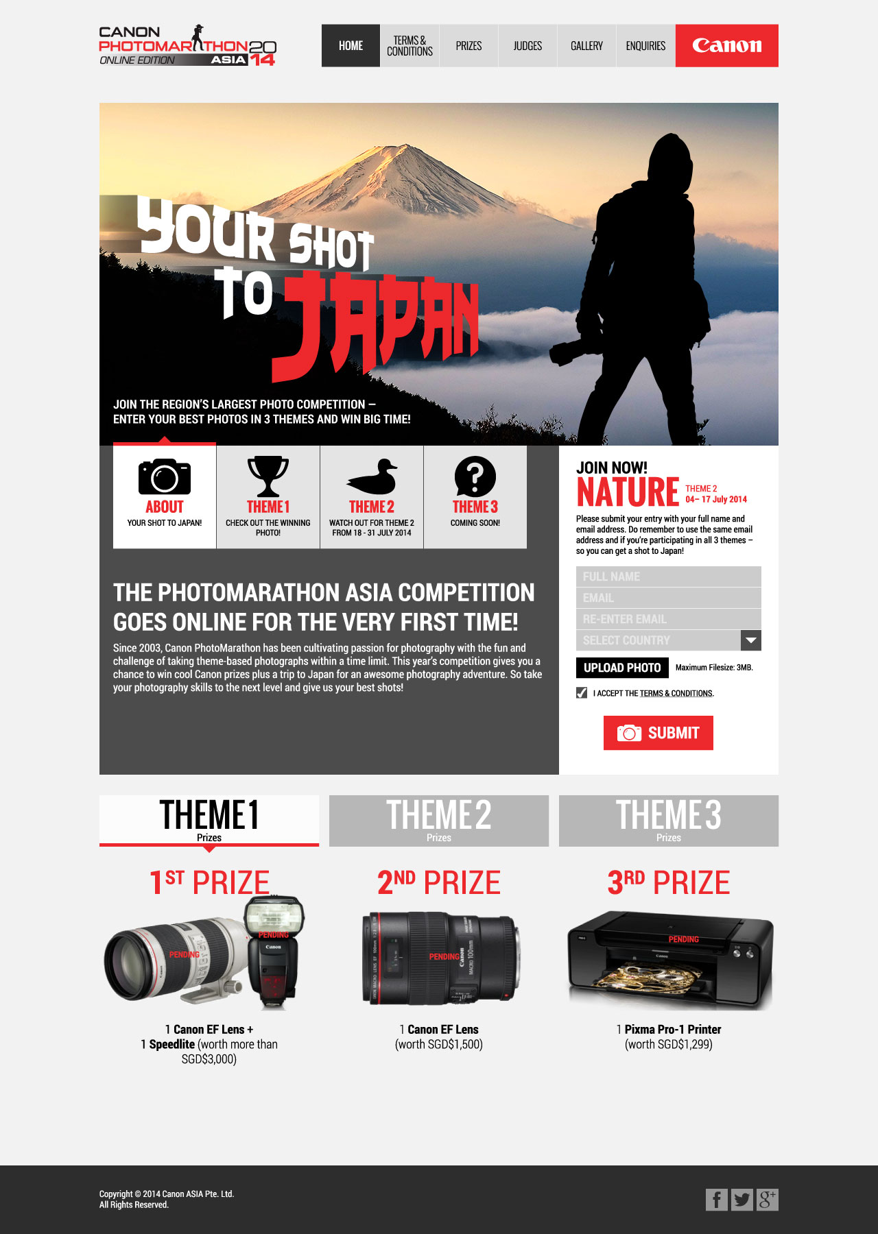
Concepts for Canon’s Online PhotoMarathon following the success of their PhotoMarathon Challenge over the past few years.
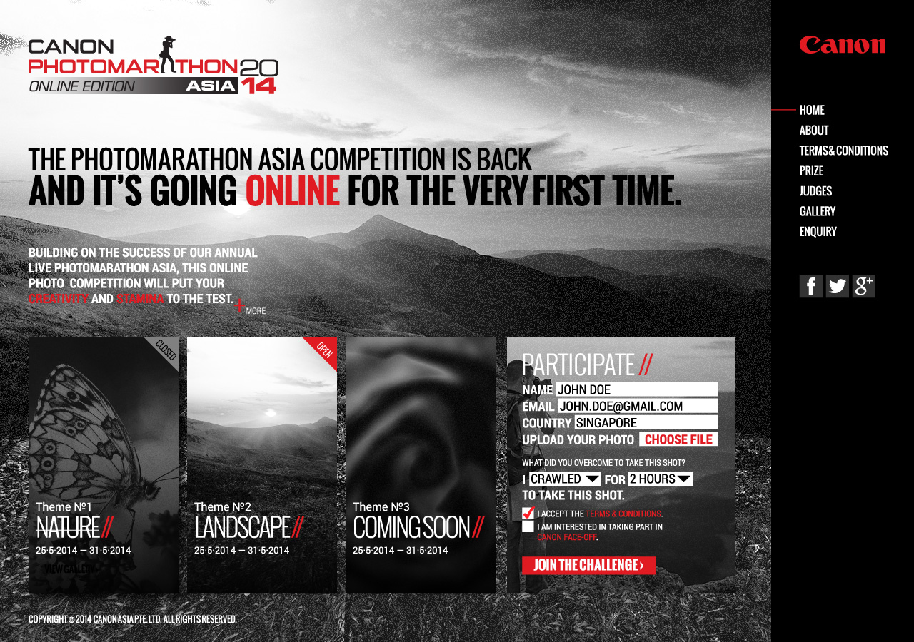
Concept A — I tried going for an adventurous, challenge-style theme.
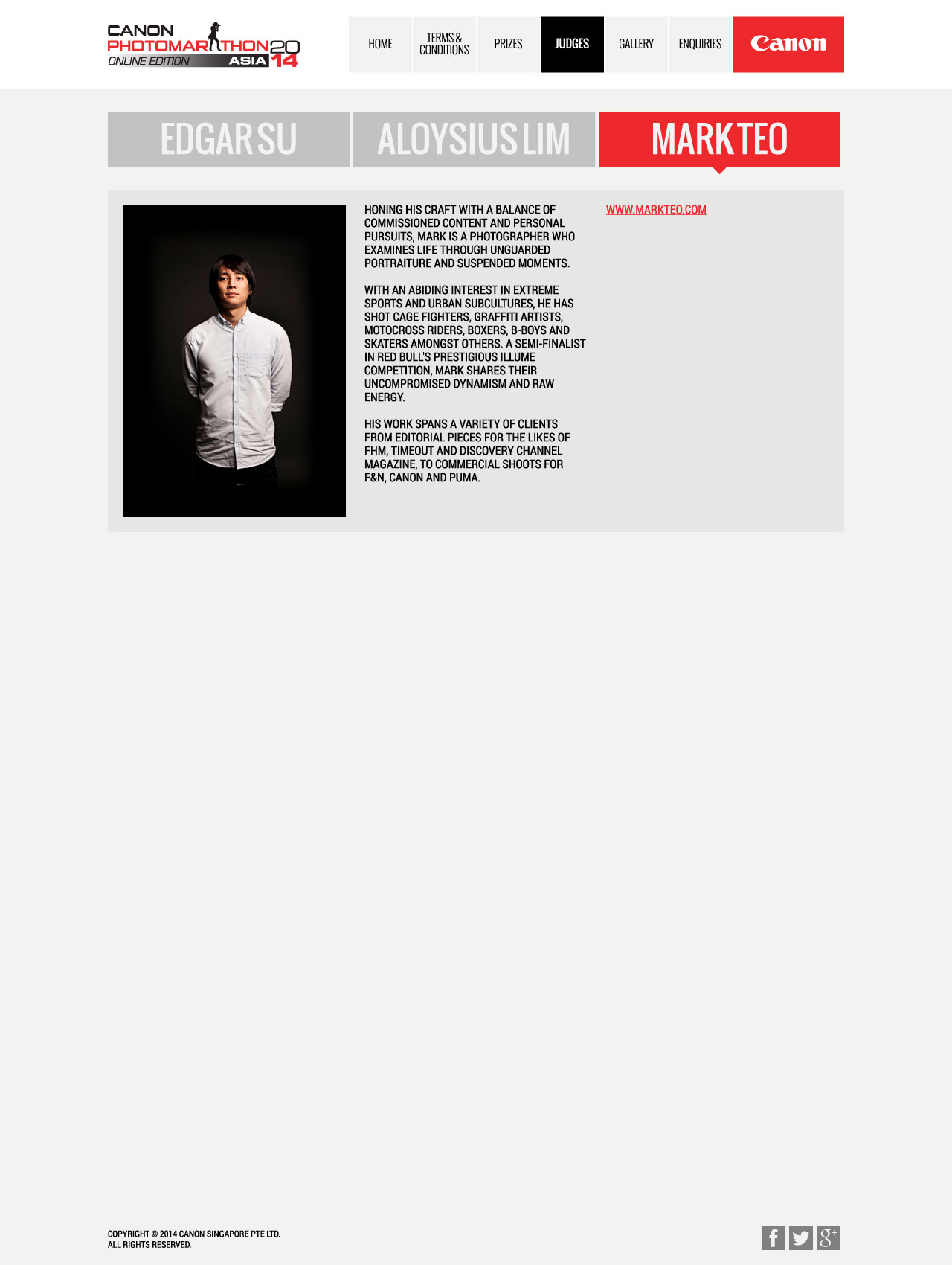
The above is Concept B, which was presented alongisde Concept A. This design features a cleaner colour scheme and a traditional layout, which the client chose.
However, midway through further development of Concept B, the client had decided to change the mechanism of the competition and had requested for an adaptation of the design to suit the new job brief.
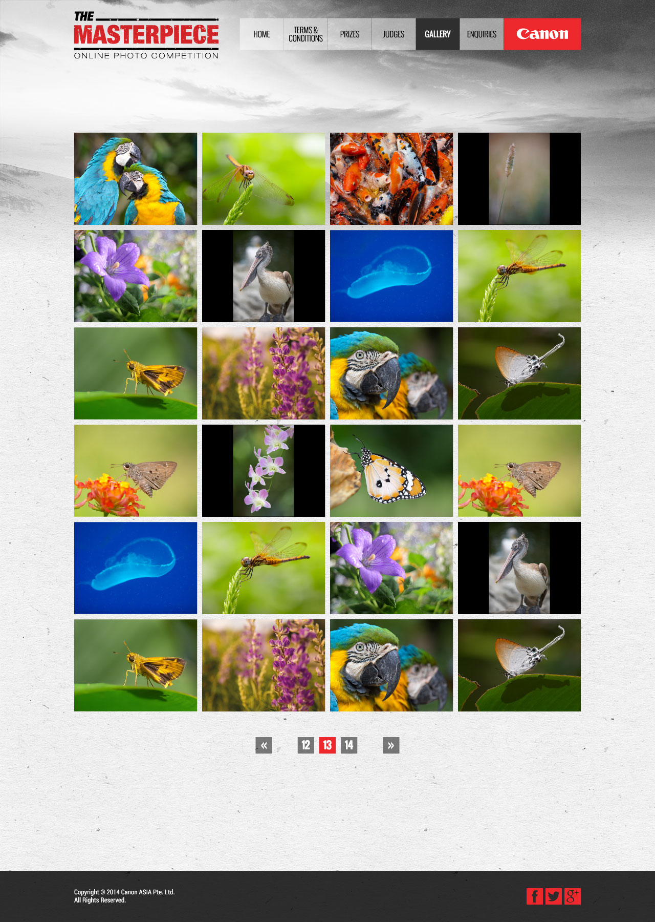
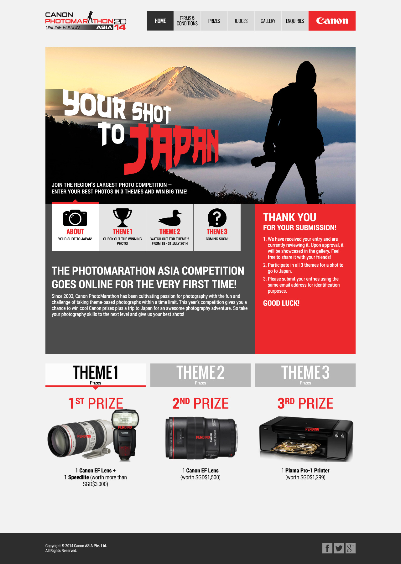
An adaptation as per client’s new direction, retaining the traditional layout with a slight thematic change as per requested.
Before we could proceed, the client had reverted to the original competition mechanism and thus requested for a refresher of the original Concept B. Hence the above was presented.
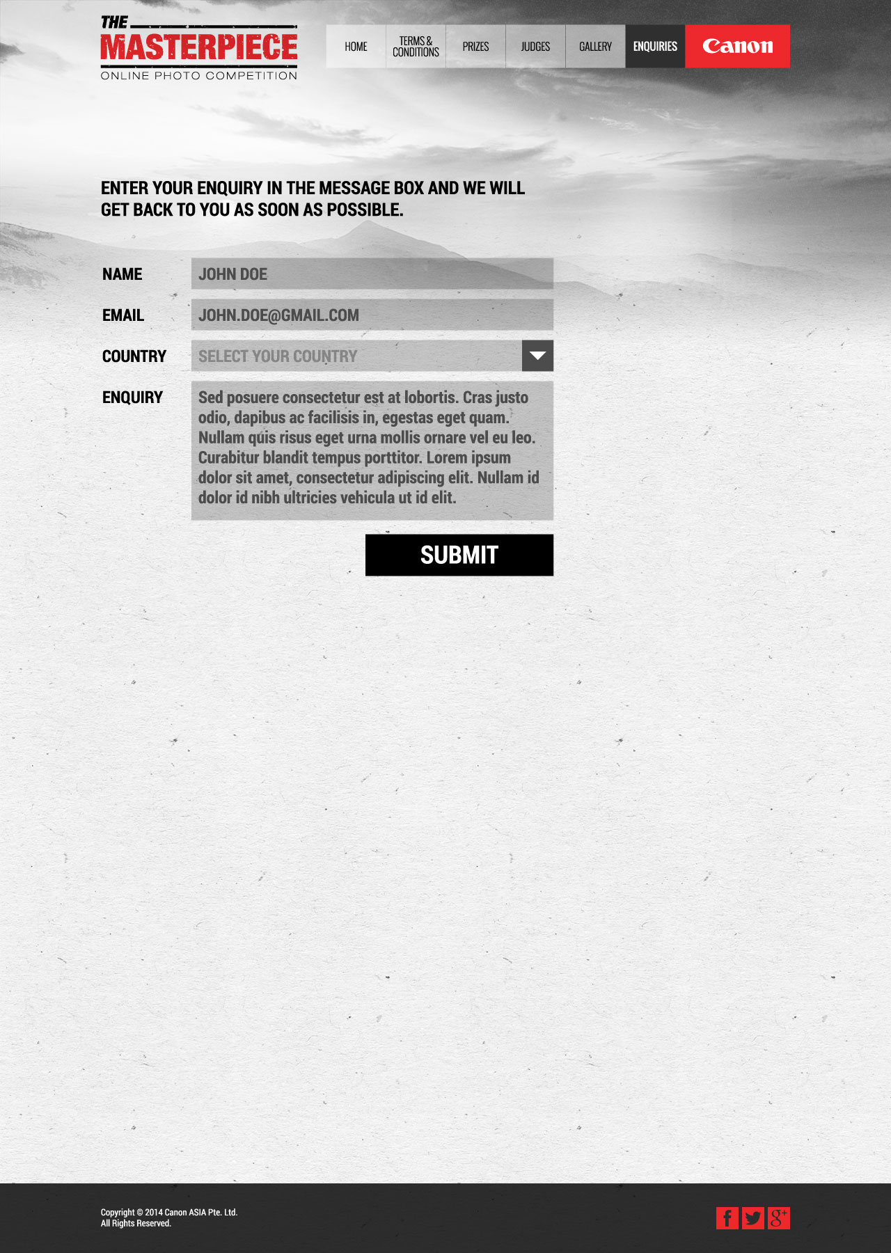
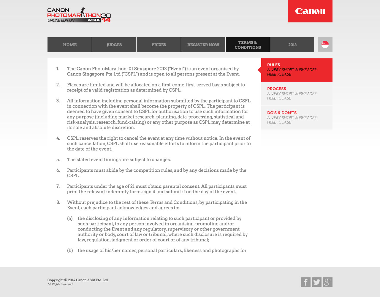
I also provided a different layout option for the client as a value add-on.
Unfortunately, the client was still not happy with both options. They iterated that they wanted something more vibrant and exciting yet modern and trendy, to target professional photographers and has to look “premium”.
Hence I proposed two new concepts…
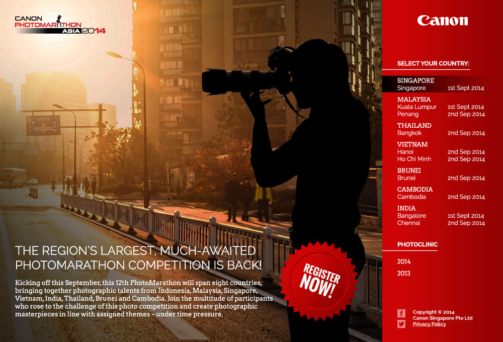
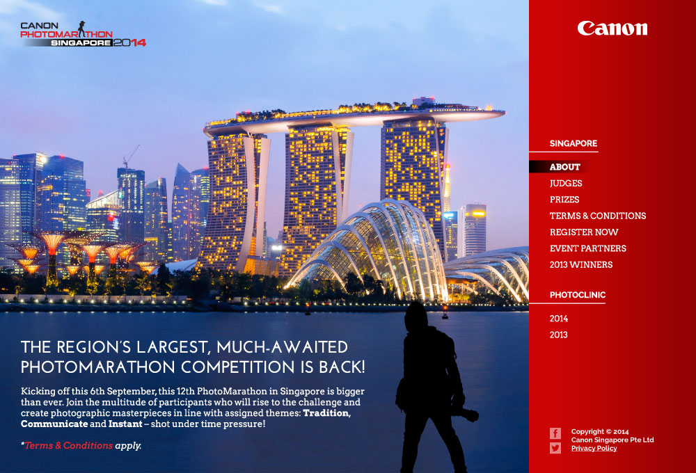
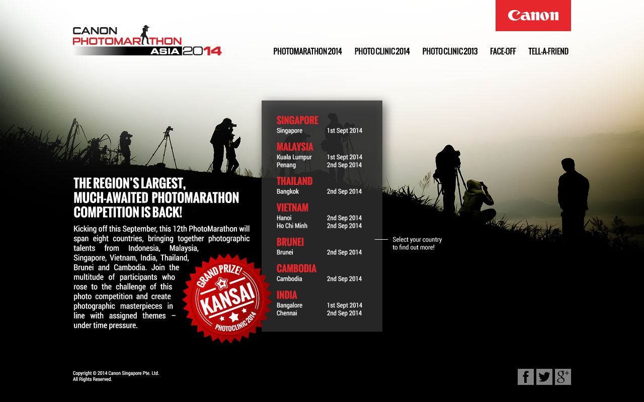
This above was a first option. As the competition now was to be replicated in the Asia Pacific region to a total of 10 cities over 7 countries, the sitemap was changed to feature a splash page for the selection of the city relevant to the user. This design proposes featuring majestic images of the selected city as full-screen background. In this concept mockup, Singapore was used as a sample.
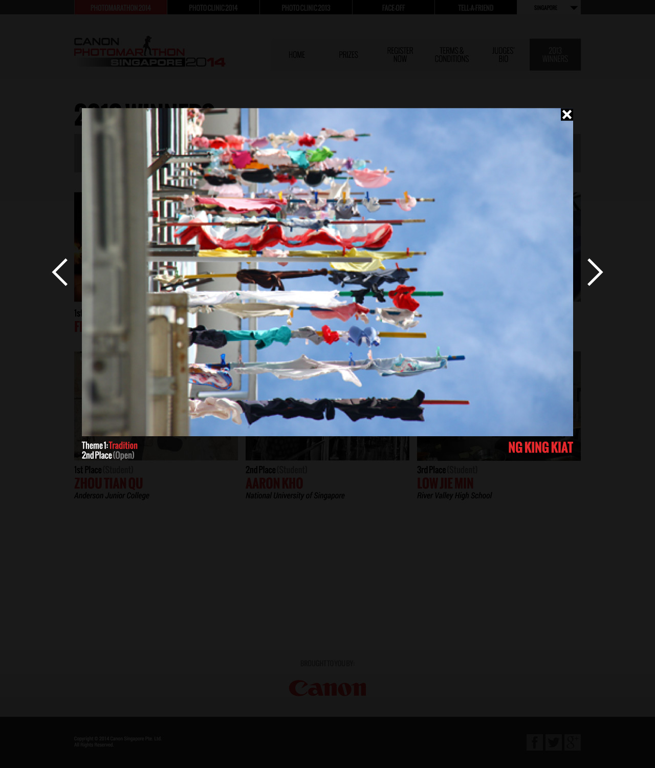
However the client stated to bring back the traditional layout of the much-earlier Concept B, preferring it’s simplicity and traditional design. Thus for this design, the whole project’s art direction got reverted (with slight modifications), including the addition of a splash page for the selection of a city.
Unfortunately, in the end this whole project was cancelled by the client.
