Canon requested a responsive website for a new microsite which details the connectivity functions of their entire range of products.
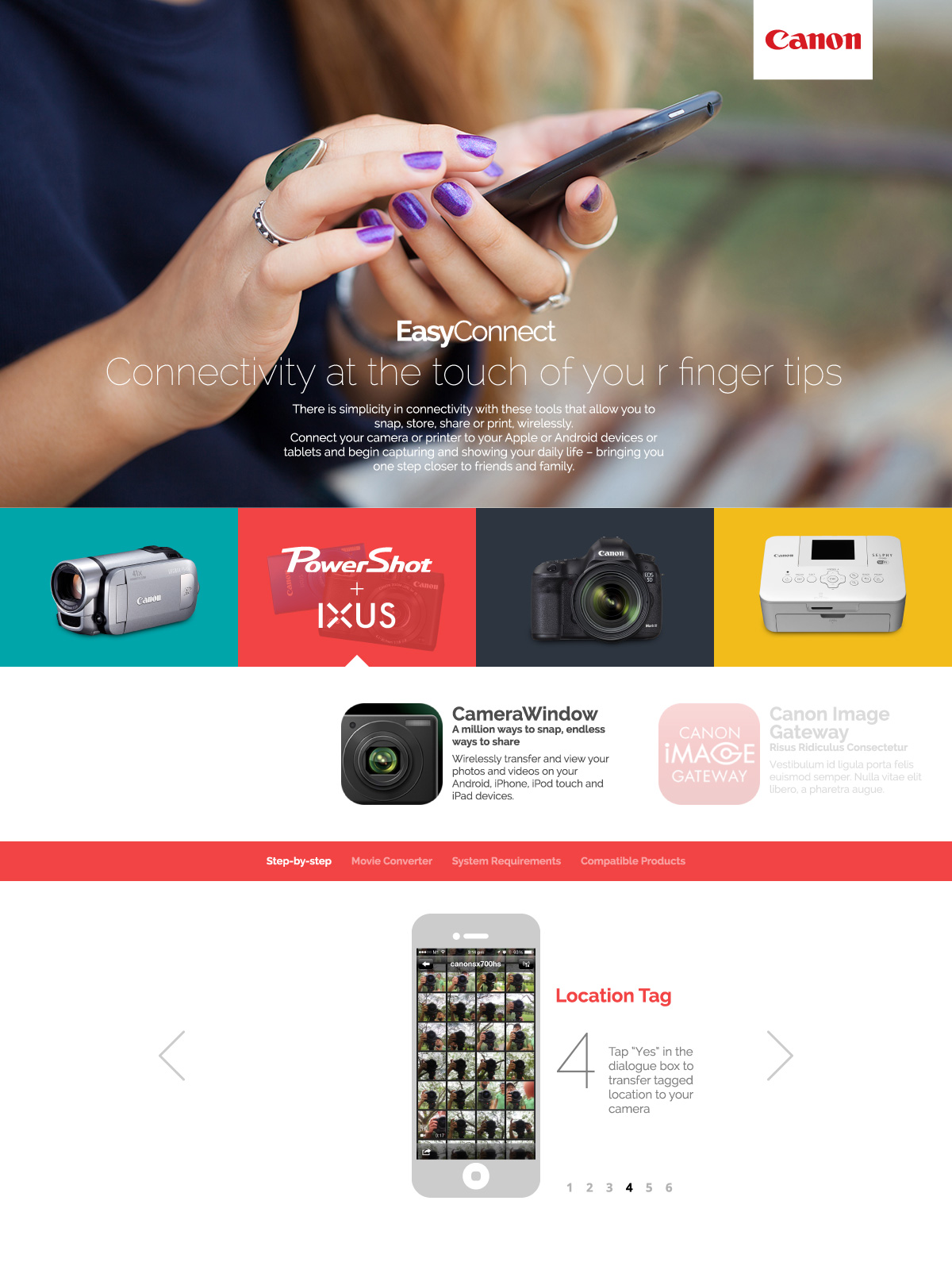
I submitted 2 proposals. Concept A — an edgy design with elements of connectivity by using lines and a long scroll.

Concept B — a safer design with standard layout for a more traditional approach.
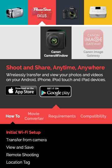
They chose Concept B, for which I began designing a layout for how the mobile version should look like.
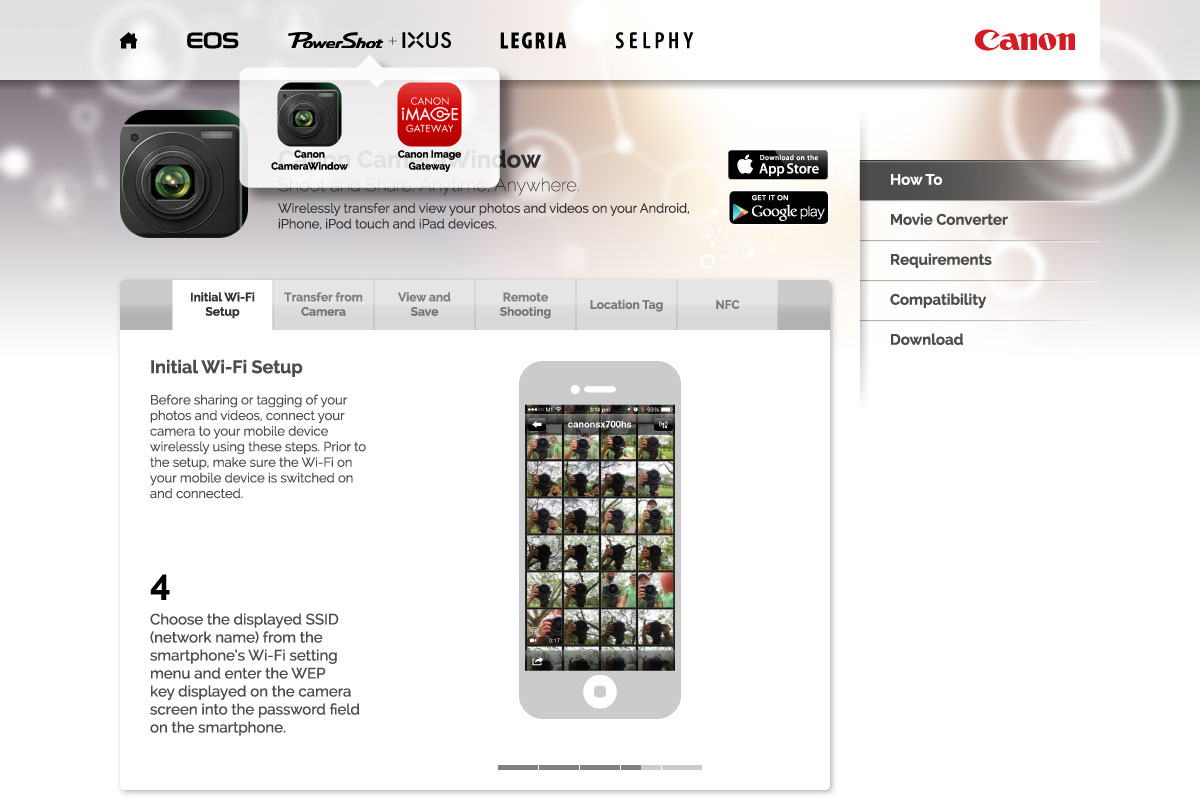
However, mid-way through the project, a change of direction occurred and Concept B was adapted into Concept C.


