Preludio
All Work / Branding / Digital / Photography / Print / Select / Videography
Located in the heart of Singapore’s business district in Tanjong Pagar, Preludio is a modern dining concept from Chef Fernando Arévalo that moves with time in orchestrated chapters. I began by simply helping the chef on the brand identity, eventually became a partner in the venture. We opened in November of 2018, debuting with the first chapter “Monochrome”, which lasted for 14 months until 1st February 2020.
Logo design
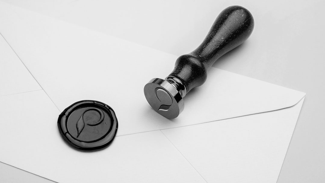
The Preludio logomark is a minimalist initial P made up of 2 main elements: a parallelogram for the stem and a crescent for the bowl. The parallelogram is created from 2 overlapping sinusoidal waves, mathematical curves that describes a smooth periodic oscillation; whereas the crescent is a subtraction of 2 solid circles into a crescent to indicate the moon, representing the idea of constant change.

The Preludio logo can be interpreted in 3 ways. First: the stem of the logomark indicates a spring leaf growing, paying homage to the farmers and producers who bring the best seasonal ingredients to the table. Second: a crescent is formed to represent the moon and its phases, the harbinger of change, an integral philosophy of the restaurant. Third, the nib of a pen traces out an incomplete circle, demonstrating the concept of an author (to reflect the restaurant’s “Author’s Cuisine”), with an open circle to indicate that our story is still continuing.
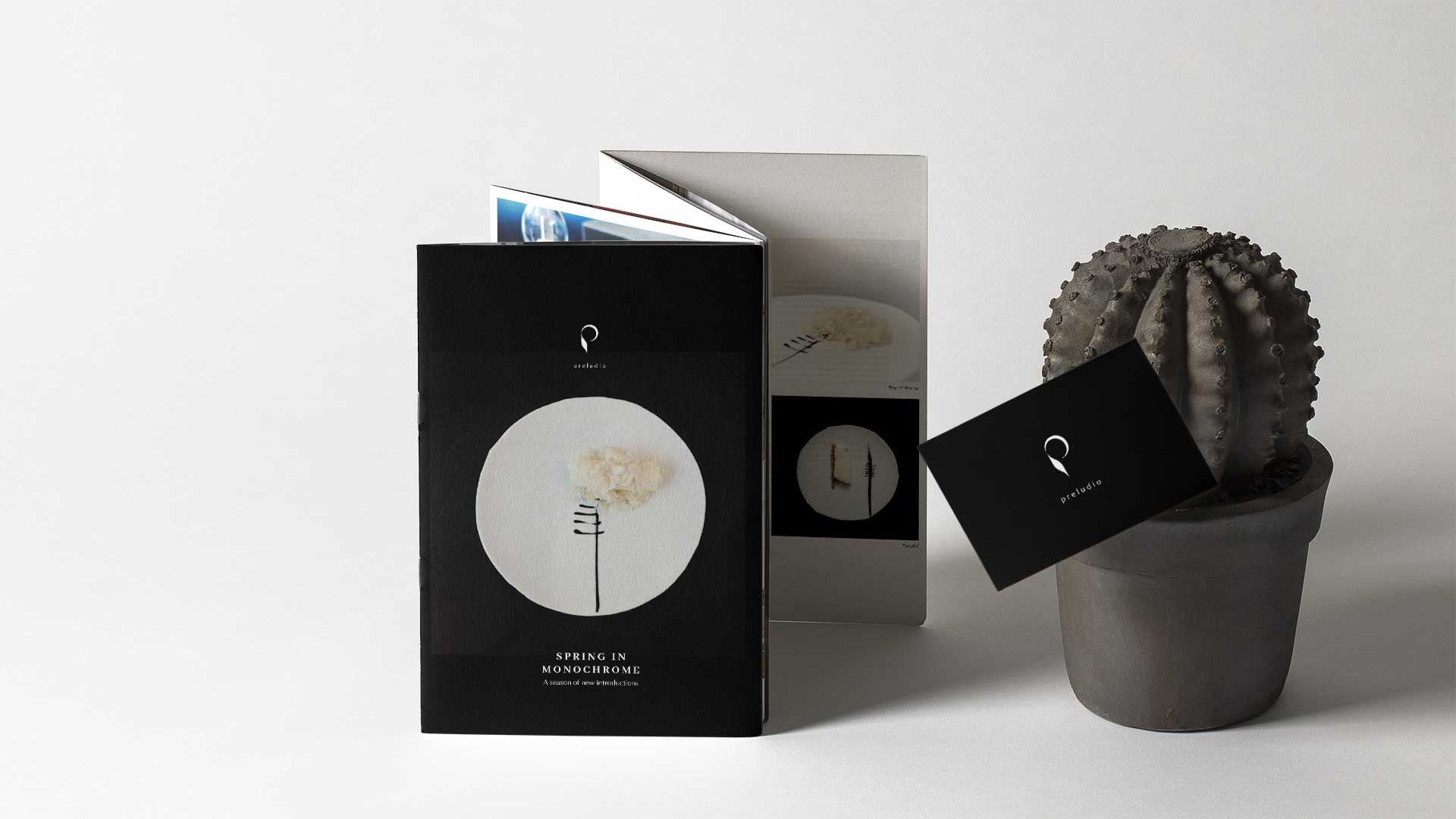
Brand Collaterals
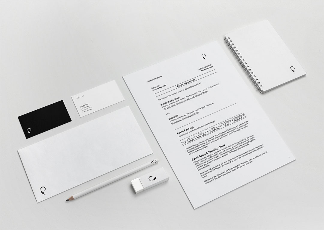
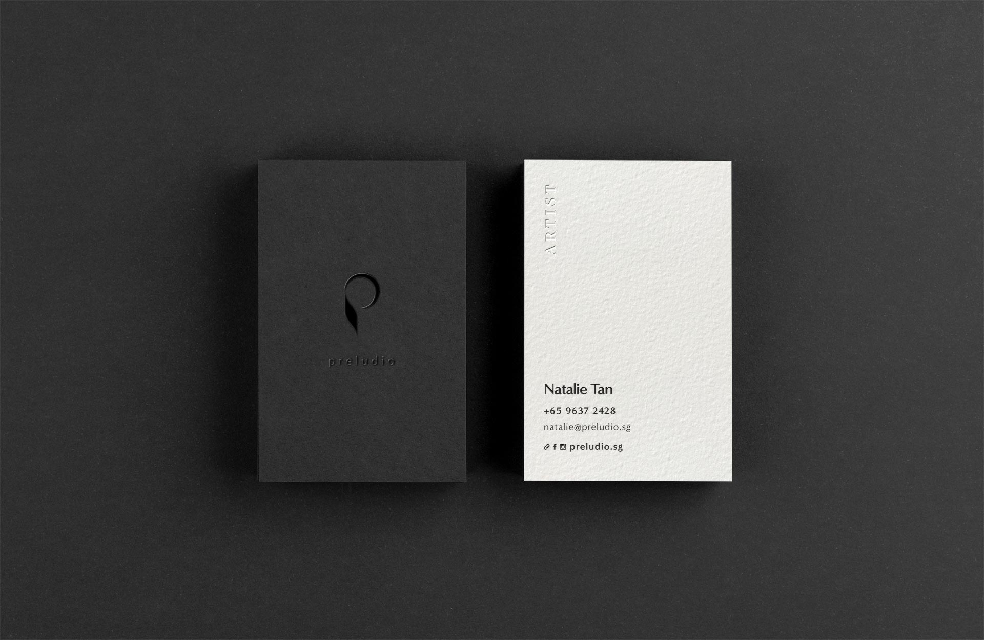
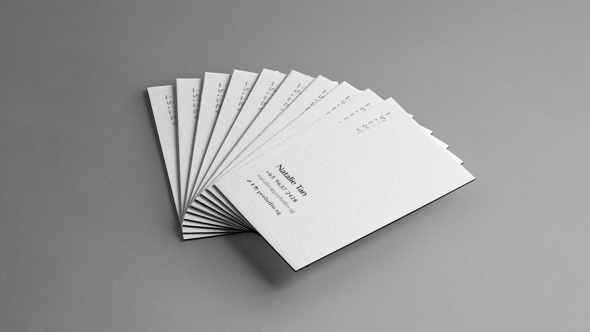
Business Cards
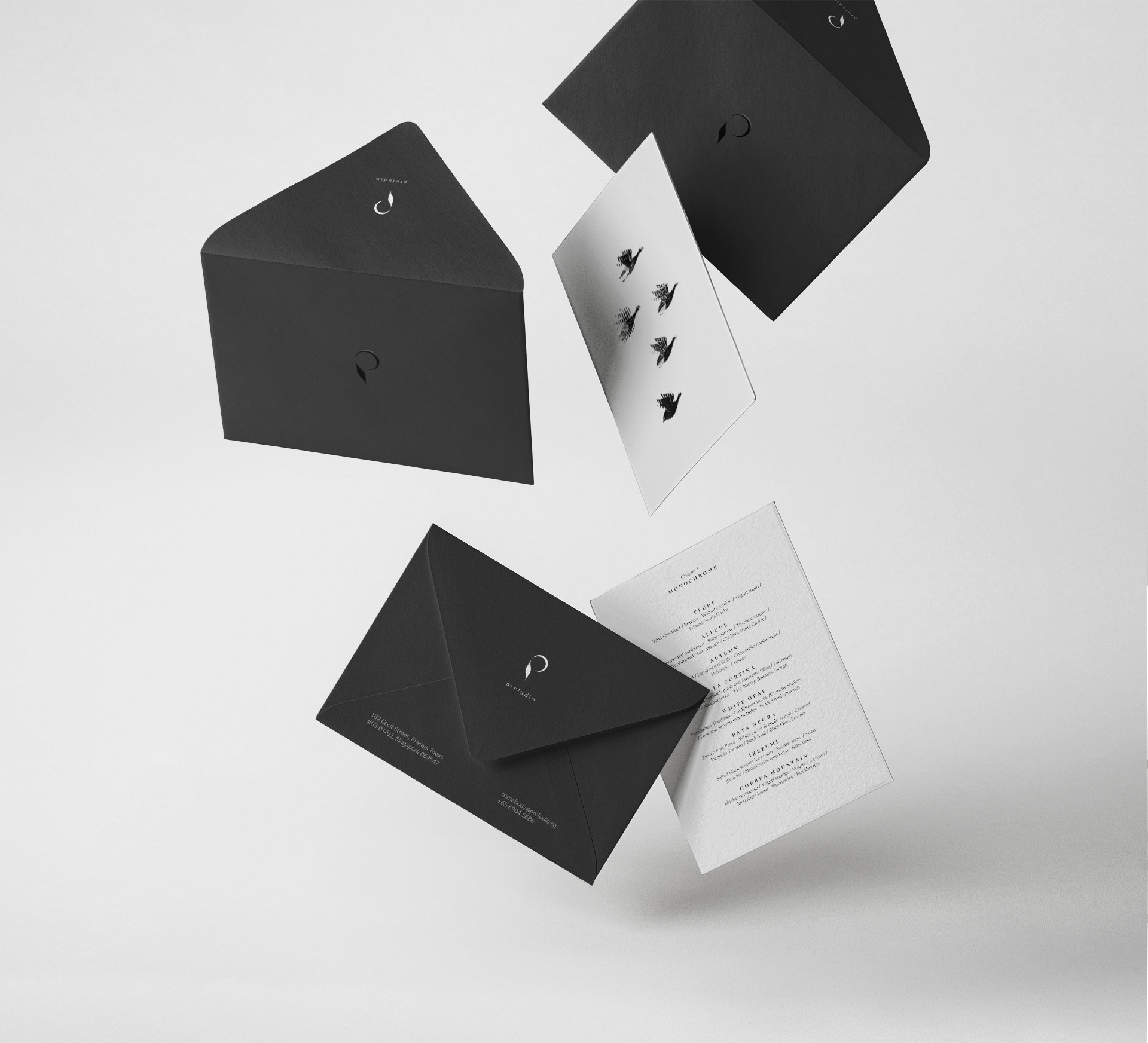
Press Materials

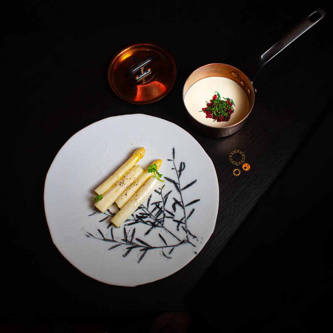
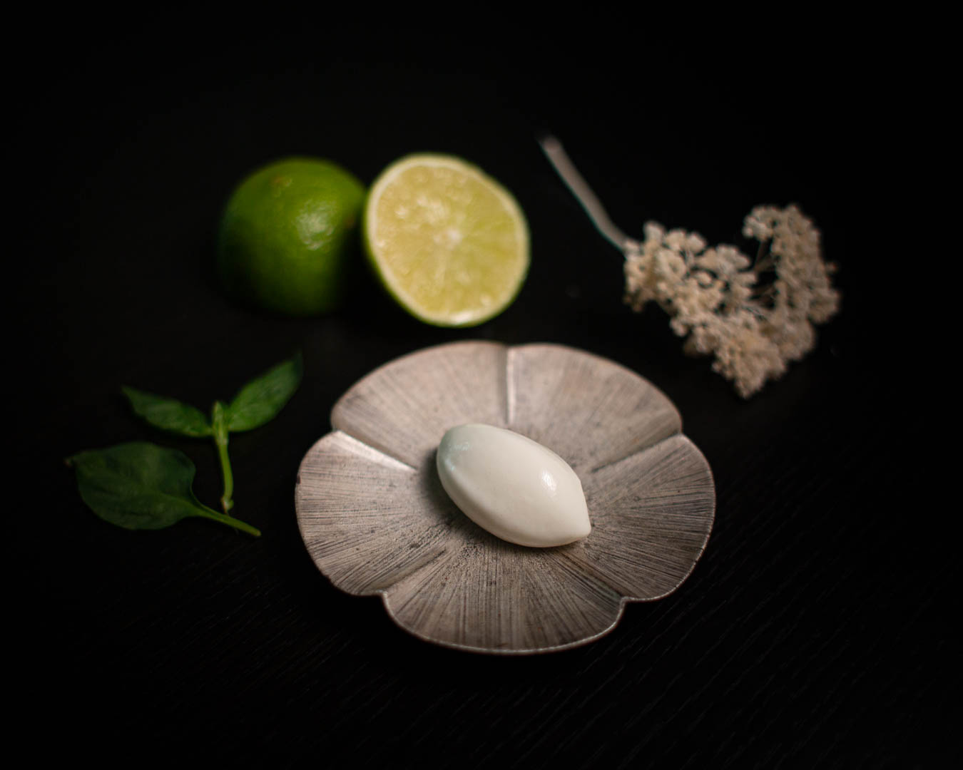
Photography
I usually shoot on a Canon EOS 5D Mark III, using the following lens kit:
- Canon EF 28mm f/1.8 USM prime lens
- Canon EF 17-40mm f/4L USM wide angle zoom lens
- Canon EF 70-300mm f/4.5-5.6 DO IS USM telephoto lens
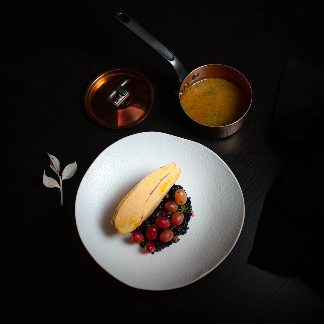
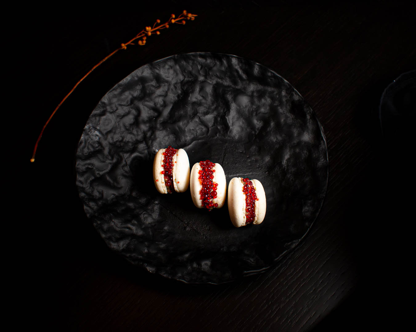
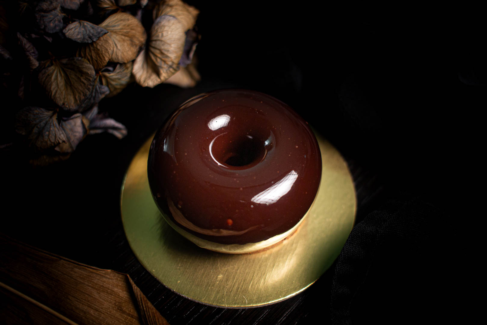
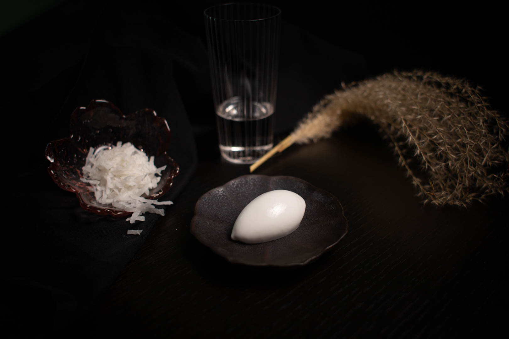
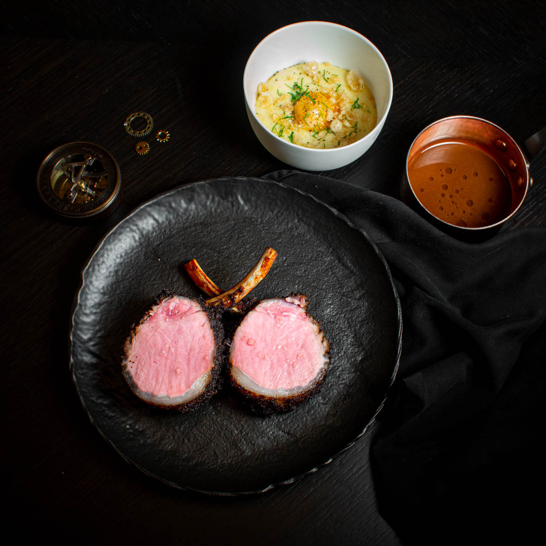
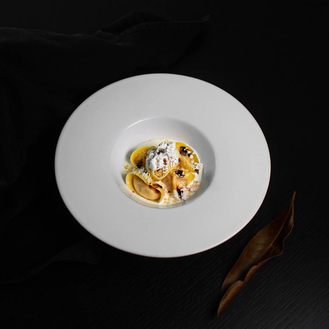
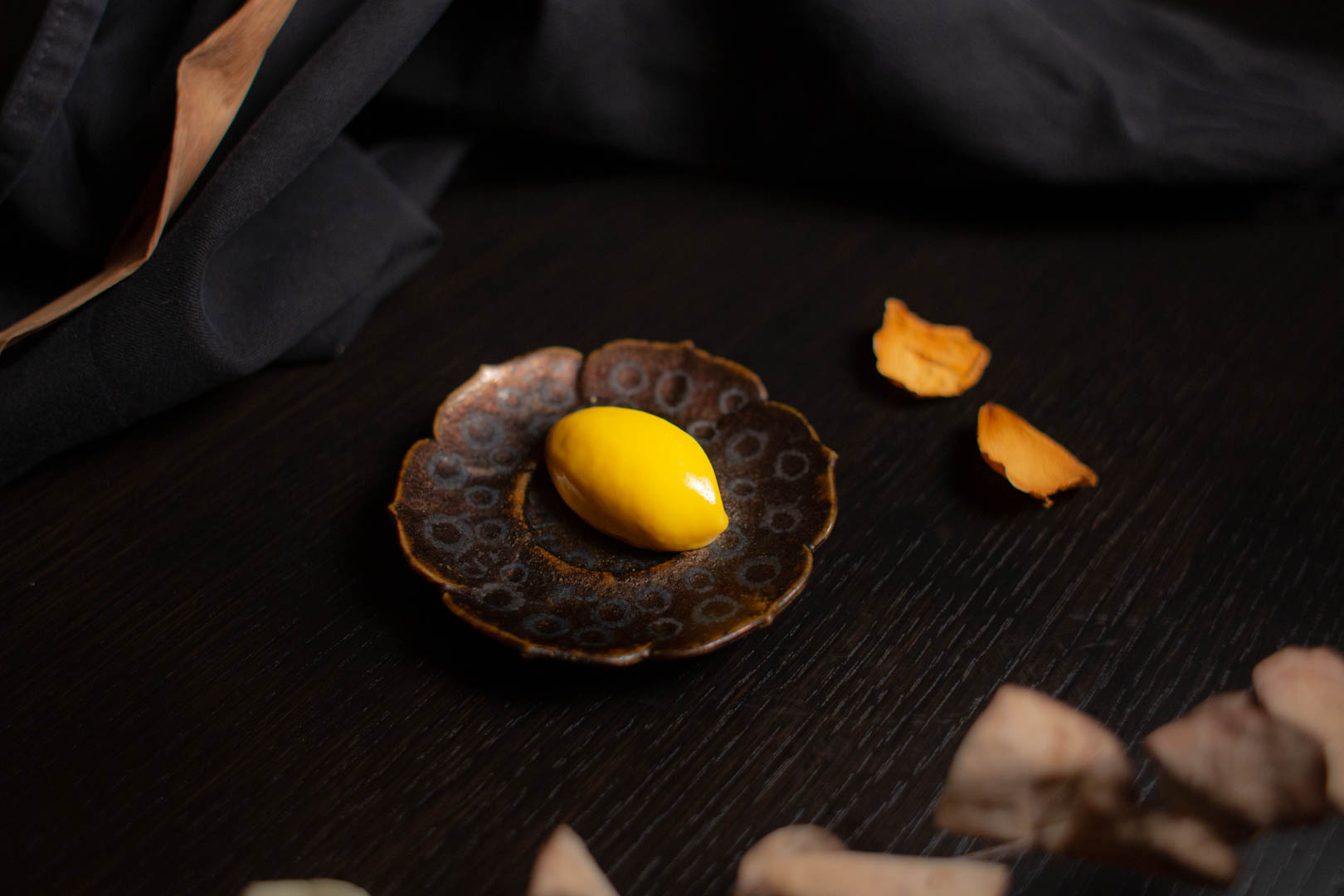
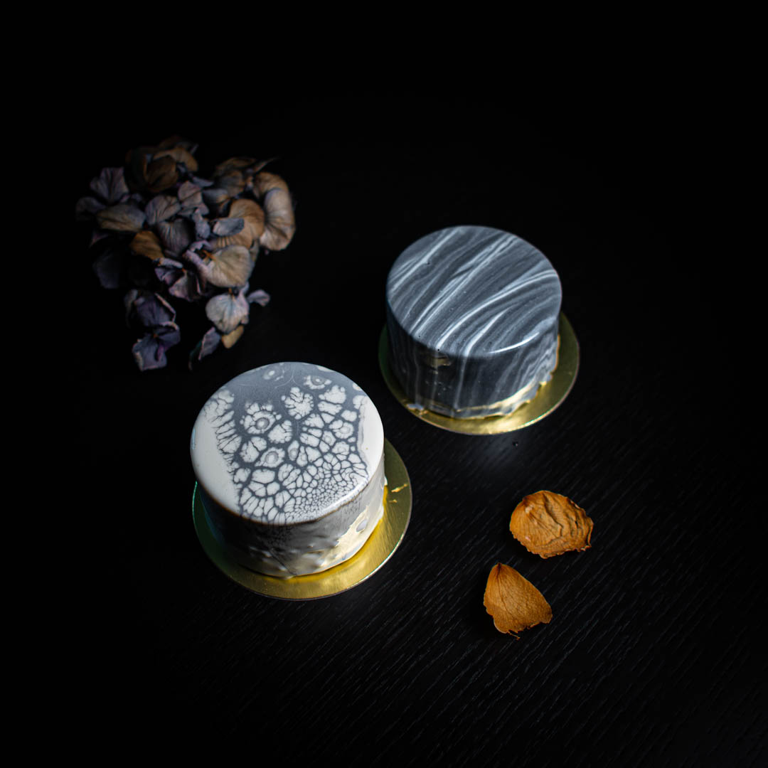
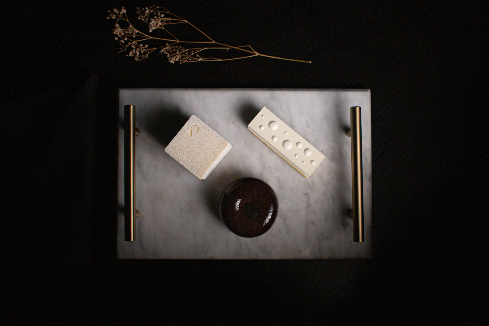
Food photography


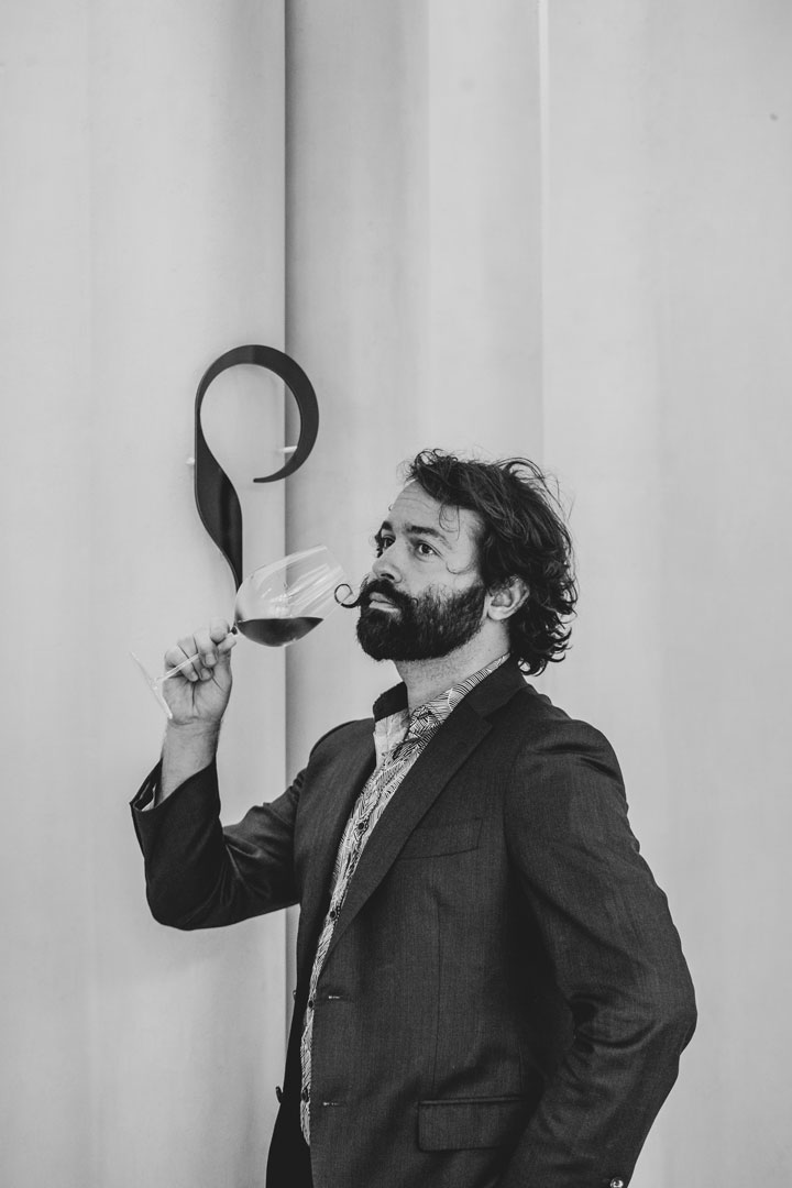
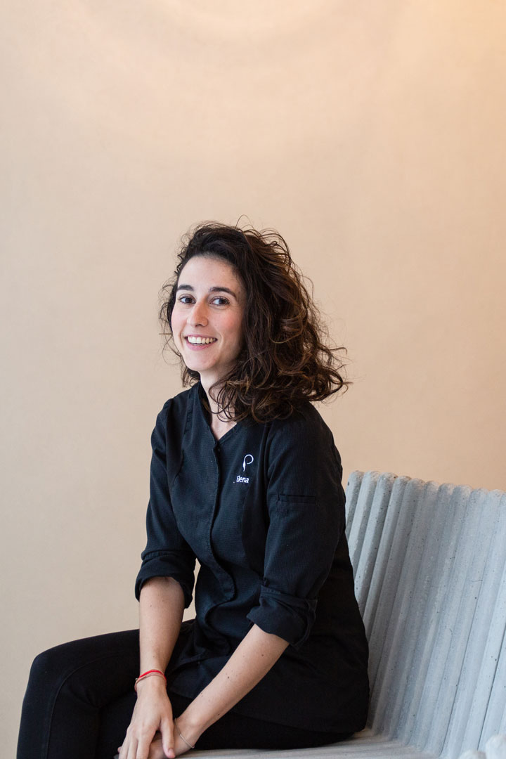
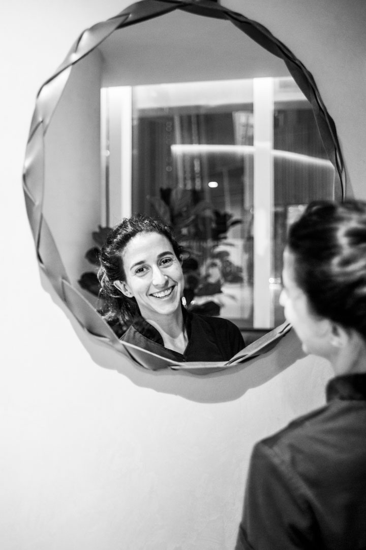
Portrait Photography


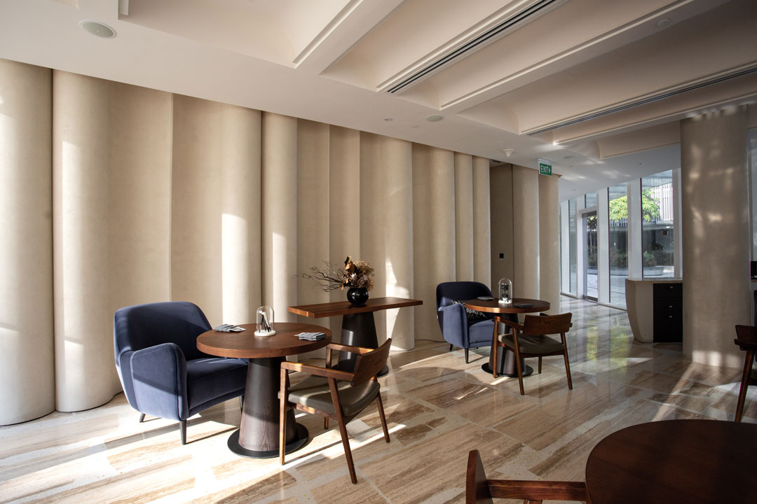
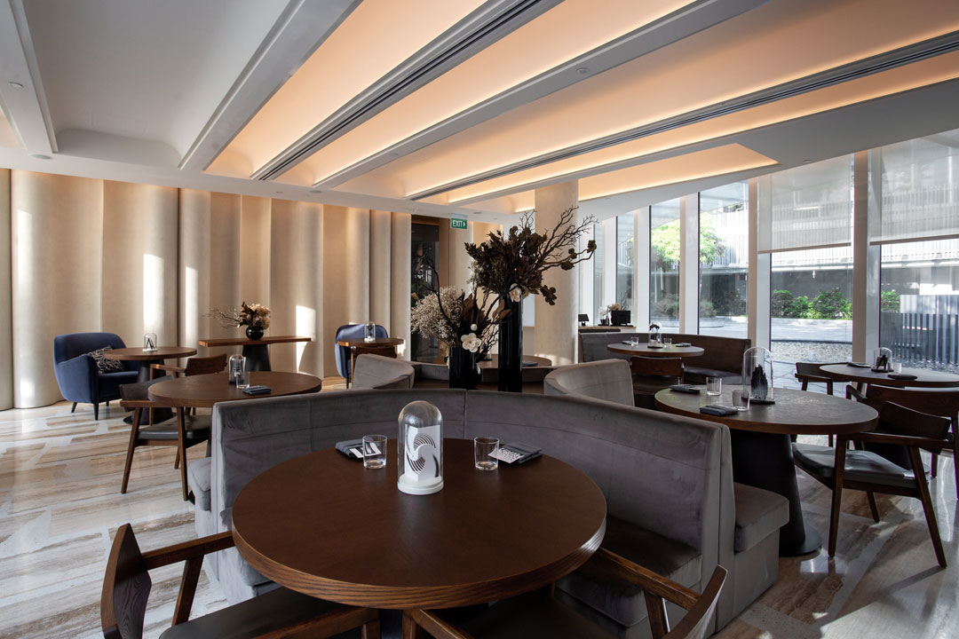
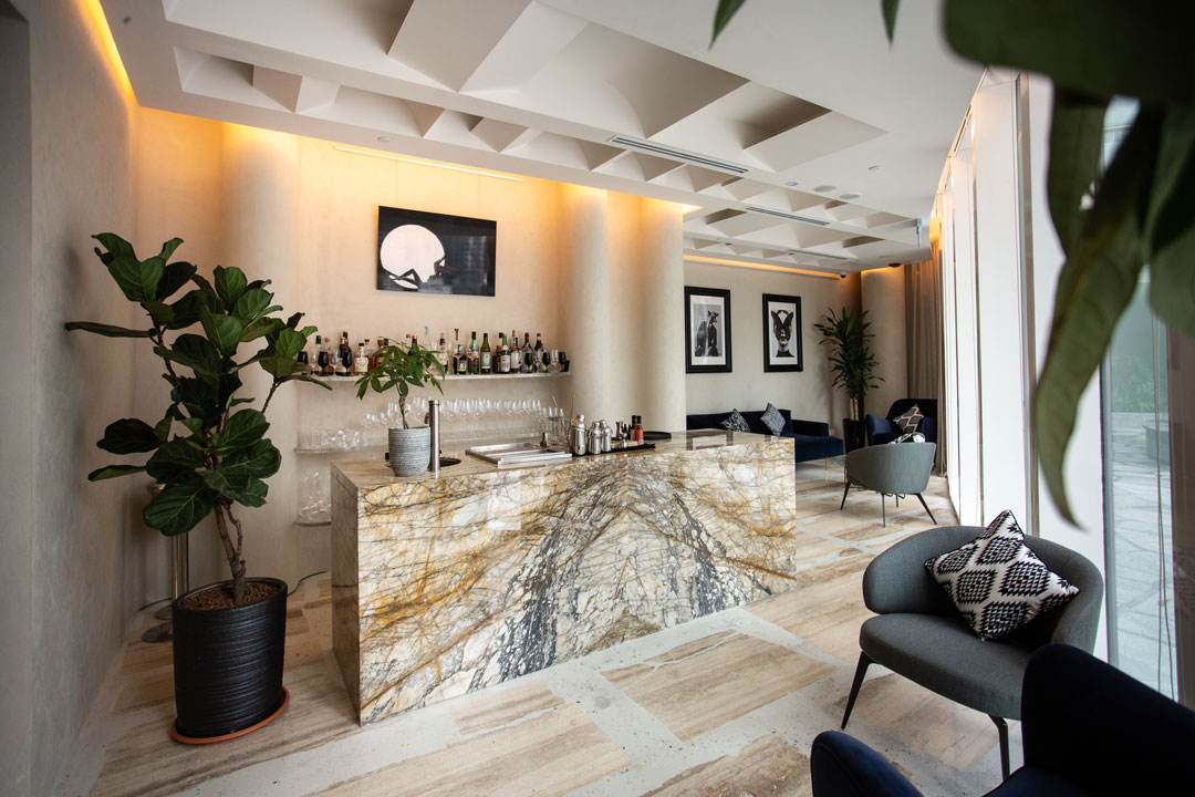
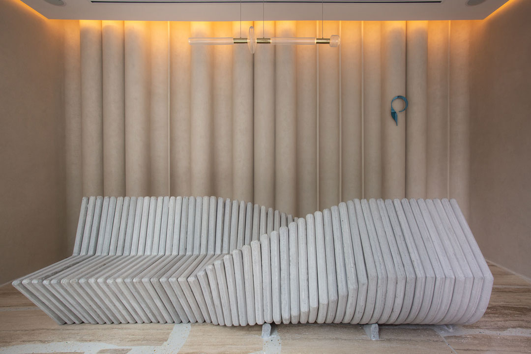
Interior Photography


Webdesign & Development
The website is a custom hardcoded theme using WordPress as a CMS. I used HTML5, SASS, and jQuery.
Social Media (Facebook/Instagram)
I also manage the restaurant’s social media, using the content I shot, writing captions and scheduling posts.
Videography
I also create video content for the restaurant’s social media pages. I shoot on the same camera that I use for still photography, and edit in Premiere Pro and After Effects.
Cinemagraphs
I shot the core team (Chef/Owner Fernando Arévalo, Pastry Chef Elena Perez, and Sommelier Chip Steel) in their element, then edited into timeless cinemagraphs.